


Sep 09, 2024
Save for later


Introduction: Healthcare is becoming increasingly digital. Patients today expect faster access to doctors, virtual consultations, digital prescriptions, and healthcare support directly from their smartphones. Long waiting times, travel limitations, and overloaded healthcare systems have accelerated the demand for telemedicine platforms across the world. This shift has made telemedicine app development one of the fastest-growing sectors […]
 React native Experts

Introduction: Most travelers no longer call hotels to make reservations. They compare prices, check reviews, browse rooms, make payments, and manage bookings directly from their phones. If your hotel business does not offer a smooth mobile experience, users move to platforms that do. That is why hotel booking app development is becoming essential for hotels, […]
React native Experts

Introduction: As Software as a Service companies compete for user attention, mobile access is no longer optional. Customers expect to manage accounts, receive updates, collaborate with teams, and complete tasks directly from their smartphones. That is why many fast-growing companies are choosing React Native for SaaS mobile apps. React Native helps SaaS brands launch high-quality […]
React native Experts

Why Businesses Are Switching to React Native for App Development Mobile app development has become a critical part of digital transformation, but building separate apps for Android and iOS can be expensive and time-consuming. This is why many companies are now switching to React Native as their preferred framework. React Native allows businesses to build […]
React native Experts
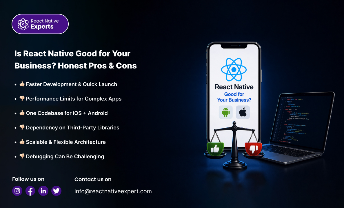
Is React Native the right choice for my business? Developed by Meta, React Native has become one of the most popular frameworks for building cross-platform mobile applications. But like any technology, it comes with both advantages and limitations. This guide gives you an honest breakdown to help you make the right decision. What Makes React […]
React native Experts
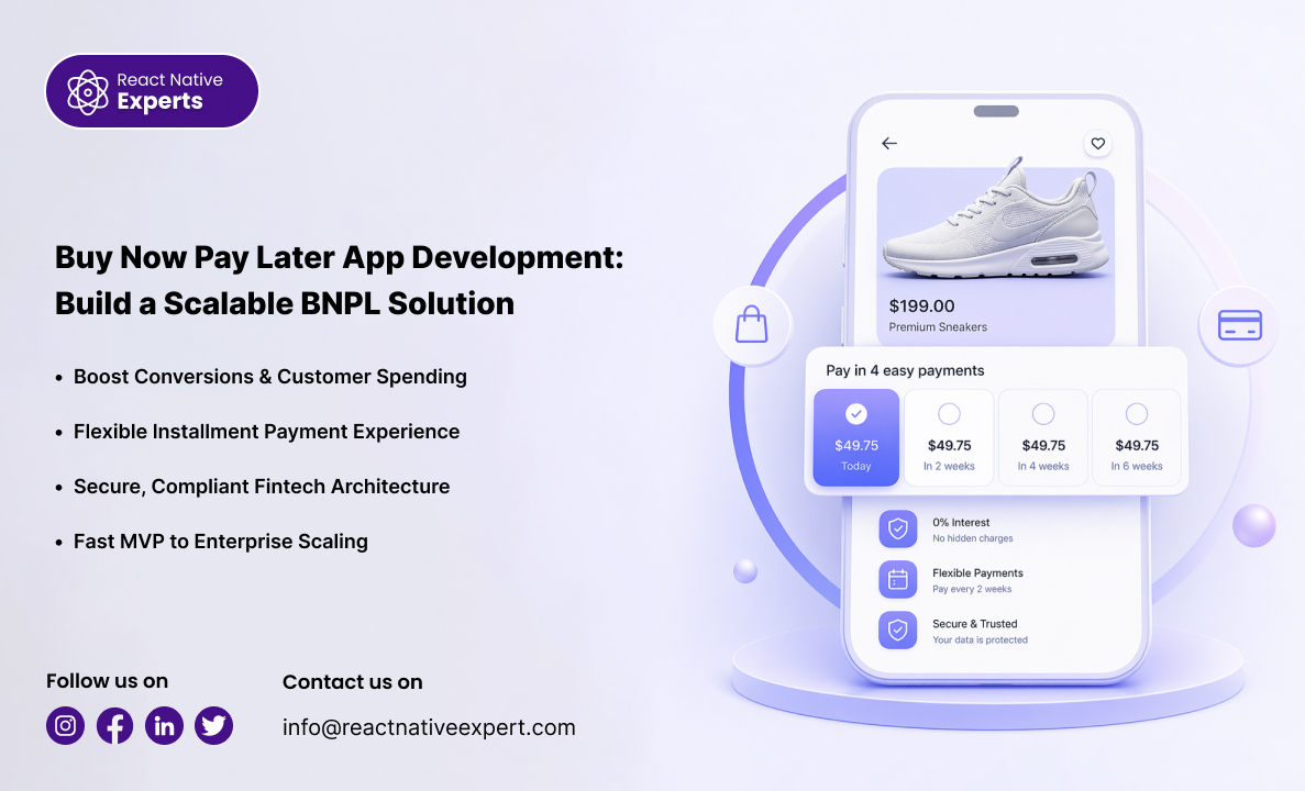
Introduction: The digital payments industry is evolving rapidly, and Buy Now Pay Later (BNPL) has become one of the most popular financing models for consumers and merchants. Instead of paying the full amount upfront, users can split purchases into smaller installments over time. This shift in consumer behavior has created a major opportunity for fintech […]
React native Experts

Introduction: The healthcare industry is undergoing rapid digital transformation, driven by the need for better patient care, remote access, and data-driven decision-making. Digital health app development plays a crucial role in this evolution by enabling healthcare providers to deliver efficient, accessible, and personalized services. From telemedicine platforms to fitness tracking apps, digital health solutions are […]
React native Experts

Introduction: Launching a startup often means making difficult decisions about where to invest limited time and resources. Mobile app development is one of the biggest investments many startups make, and choosing the right technology stack can significantly affect costs, development speed, and future scalability. This is why React Native apps for startups have become increasingly […]
React native Experts

Introduction: Mobile app development continues to evolve rapidly, and React Native remains at the forefront of this transformation. Businesses are increasingly adopting React Native to build scalable, high-performance applications while reducing development time and costs. As competition grows, staying updated with the latest React Native trends is essential for building future-ready applications that deliver strong […]
React native Experts

Introduction: The food delivery industry has seen massive growth in recent years, driven by changing consumer habits and the demand for convenience. Platforms like Zomato and Uber Eats have completely transformed how people discover and order food. For businesses, this presents a strong opportunity. Investing in food ordering app development allows you to build a […]
React native Experts

Introduction: Real estate mobile applications have become essential tools for property agencies, brokers, developers, and real estate marketplaces. Today’s buyers and renters expect to browse listings, view property photos, schedule visits, communicate with agents, and receive property updates directly from their smartphones. As demand for digital property experiences continues growing, many businesses ask the same […]
React native Experts

Introduction: Car ownership is changing. Many people today no longer want the long-term cost and responsibility of owning a vehicle full time. Instead, users increasingly prefer flexible transportation options that allow them to rent cars whenever needed through mobile apps. This shift has transformed the car rental industry dramatically. Modern customers expect to browse vehicles, […]
React native Experts

Introduction: Manufacturing mobile app development is transforming how factories operate by enabling real-time visibility, automation, and data-driven decision-making. From production tracking to inventory management and workforce coordination, mobile apps help manufacturers streamline operations and improve efficiency. If you are dealing with delayed reports, manual tracking, miscommunication between teams, or lack of real-time visibility, you are […]
React native Experts
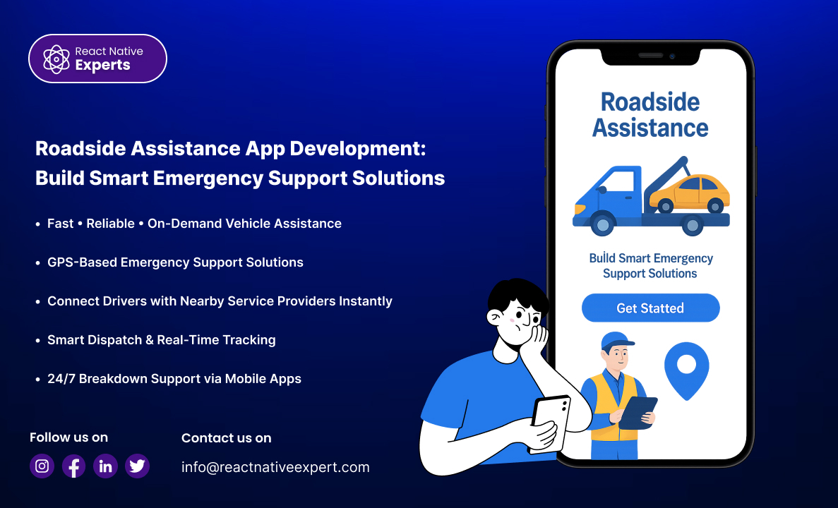
Introduction When drivers face a breakdown, flat tire, dead battery, or accident, speed matters. Most people do not want to search online, make multiple calls, or explain their location repeatedly during a stressful situation. They expect instant roadside assistance directly from their phone. That is why road assistant app development is growing rapidly across towing […]
React native Experts
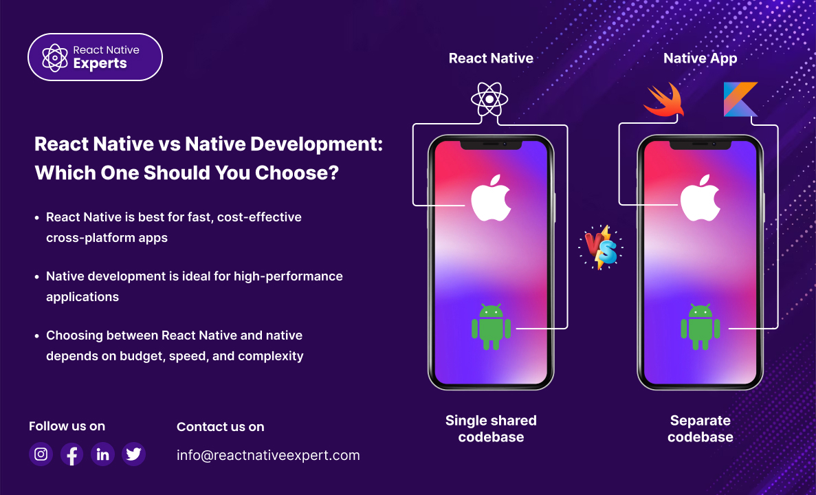
Introduction: Choosing between React Native vs native development is a critical decision when building a mobile app. Both approaches have their advantages, and the right choice depends on your business goals, budget, timeline, and performance requirements. This guide breaks down the differences, benefits, and ideal use cases to help you make the right decision. What […]
React native Experts

Introduction: React Native continues to evolve to support better performance, improved scalability, and more efficient communication between JavaScript and native platforms. The introduction of the React Native New Architecture represents a major step forward in how mobile applications are built. Migrating to the new architecture helps developers improve app performance, reduce latency, and take advantage […]
React native Experts

Introduction: The demand for diet and nutrition app development is growing fast as healthcare providers, startups, wellness brands, and connected device companies seek smarter digital solutions. Users now expect personalized nutrition plans, progress tracking, wearable syncing, and expert guidance in one easy-to-use app. For businesses, this creates a major opportunity to improve engagement, build recurring […]
React native Experts

Introduction: Every successful app started as a simple idea, but the graveyard of failed startups is filled with products that were built too big, too slow, and without checking to see if there was any real market demand. That’s why partnering with the right MVP app development company can be the most important decision you […]
React native Experts

Introduction: The demand for B2B mobile app development is growing rapidly as businesses seek faster operations, better customer experiences, and smarter digital workflows. Modern companies need mobile solutions that improve communication, automate tasks, and support decision-making across teams, partners, and clients. For organizations focused on growth, a custom B2B mobile app creates new opportunities to […]
React native Experts

Introduction: Most online shoppers no longer want to browse through slow websites or complicated checkout pages. They want fast product discovery, smooth payments, personalized recommendations, and instant updates directly from their phones. That is why ecommerce mobile app development has become a priority for brands, retailers, and online businesses looking to improve customer experience and […]
React native Experts

Introduction: Building a mobile app from scratch can be expensive, time-consuming, and resource-intensive. For many businesses, agencies, startups, and entrepreneurs, speed-to-market is often just as important as innovation. This is where white label mobile app development provides a compelling solution. Instead of creating an application from the ground up, businesses can use a pre-built app […]
React native Experts

Introduction: The food delivery industry continues to grow as consumers increasingly prefer ordering meals through mobile applications rather than visiting restaurants or placing orders by phone. Customers now expect fast ordering, real-time delivery tracking, multiple payment options, and seamless user experiences. As a result, restaurants, cloud kitchens, startups, and food delivery businesses are investing heavily […]
React native Experts

Introduction: An eLearning app development company helps businesses, startups, educational institutions, and enterprises design and build digital learning platforms that are interactive, scalable, and user-focused. With the rise of remote learning and digital training, eLearning apps have become essential for delivering knowledge anytime, anywhere. An experienced eLearning app development company helps educational institutions, startups, and […]
React native Experts

Introduction: Businesses today need to develop mobile applications faster than ever while maintaining high quality and controlling costs. While many companies consider hiring in-house teams or outsourcing work overseas, another model has gained significant popularity in recent years: nearshore app development. Nearshore development allows businesses to work with software teams located in nearby countries, often […]
React native Experts

Introduction: Music streaming app development focuses on creating digital platforms that allow users to stream, discover, download, and share music seamlessly across devices. With the growing demand for on-the-go entertainment, music streaming apps have become one of the most popular mobile applications worldwide. From startups launching niche audio platforms to enterprises building Spotify-like solutions, a […]
React native Experts

Introduction: A professional entertainment app development company helps startups, media brands, and enterprises build an engaging mobile application for streaming, gaming, social mesmerization, and digital content consumption. Applications such as video and music streaming, live events, or interactive entertainment platforms all provide custom solutions for a large audience with immersive user experiences. With growing demand […]
React native Experts

Introduction: The demand for doctor appointment app development is rising rapidly as healthcare organizations modernize patient access and streamline scheduling operations. Patients now expect the convenience of booking appointments, receiving reminders, accessing telehealth visits, and managing healthcare interactions directly from their smartphones. For healthcare businesses, this creates a major opportunity to improve patient satisfaction, reduce […]
React native Experts

Introduction: Transportation has become increasingly digital. Users today expect to book rides instantly, track drivers in real time, make secure payments, and manage trips directly from their smartphones. Traditional taxi booking systems and manual dispatch operations are no longer enough to meet modern customer expectations. This shift has made taxi app development one of the […]
React native Experts

Introduction: The global fintech industry continues to grow rapidly as consumers increasingly rely on digital banking, mobile payments, investment platforms, digital lending, and embedded finance solutions. Building a fintech product today is no longer just about creating a mobile app; it requires enterprise-grade security, regulatory compliance, scalable architecture, and seamless user experiences. Whether you’re launching […]
React native Experts

Introduction: Transportation is becoming increasingly digital. Customers now expect real-time tracking, instant booking, accurate ETAs, cashless payments, and seamless communication directly from their smartphones. Whether it is ride-sharing, fleet management, public transit, logistics, or delivery coordination, mobile technology is transforming how transportation businesses operate. That is why transportation app development has become a major investment […]
React native Experts

Introduction: The home services industry is rapidly moving toward digital convenience. Customers no longer want to spend hours searching for plumbers, electricians, carpenters, painters, or repair professionals through phone directories and local advertisements. Instead, they expect to book trusted service providers instantly through mobile applications. This growing demand has made handyman app development one of […]
React native Experts

Introduction: React Native app development cost is one of the most searched topics for startups, enterprises, and product owners planning cross-platform mobile applications. Businesses want to understand how much it costs, what factors influence pricing, and whether React Native is cost-effective compared to native development. This guide breaks down React Native app development pricing, cost […]
React native Experts

What Is React Native Paper Drawer? React Native Paper Drawer is a Material Design-styled drawer component provided by the react-native-paper library. It is commonly used with React Navigation to build a side navigation menu (sidebar) in React Native apps. It is ideal for: Admin panels Dashboard apps Multi-screen mobile applications Material Design–based UI When to […]
React native Experts

Introduction: Travelers no longer want complicated booking processes, delayed updates, or disconnected travel experiences. They expect everything to work from their phone. Searching destinations Booking hotels and flights Managing itineraries Receiving travel updates Accessing maps and recommendations This shift is why travel businesses are investing heavily in mobile technology and searching for the right travel […]
React native Experts

Introduction: Healthcare is becoming more accessible, convenient, and technology-driven than ever before. Patients today expect to order medicines online, upload prescriptions digitally, track deliveries in real time, and receive healthcare products directly at their doorstep. As consumer expectations continue evolving, pharmacies and healthcare providers are increasingly investing in medicine delivery applications to improve service quality […]
React native Experts

Introduction: The demand for restaurant mobile app development is growing rapidly as food businesses look for smarter ways to increase direct orders, improve customer loyalty, and streamline day-to-day operations. Today’s diners expect mobile ordering, real-time delivery updates, personalized rewards, and seamless table reservations directly from their smartphones. For restaurant brands, this creates a major opportunity […]
React native Experts

Introduction: Building a mobile app today often means reaching users on both iOS and Android. For many businesses, developing separate applications for each platform can increase costs, extend timelines, and create ongoing maintenance challenges. This is where React Native for Mobile App Development has become a popular choice. Developed by Meta, React Native allows businesses […]
React native Experts

Introduction: Consumer shopping habits have changed dramatically over the last few years. Today’s customers expect groceries to be delivered directly to their homes with just a few taps on a smartphone. Convenience, speed, and real-time accessibility have become major factors influencing purchasing decisions. As a result, grocery delivery applications have become an essential digital solution […]
React native Experts

Introduction: The demand for convenient, fast, and reliable food delivery continues to grow across most of the countries. Restaurants, cloud kitchens, and entrepreneurs are investing in custom-built digital platforms to meet user expectations and compete with industry giants like DoorDash, Uber Eats, and Grubhub. To build a high-performance solution, partnering with a specialized food delivery […]
React native Experts

Introduction: In todays modern digital economy, enterprises are no longer relying on one-size-fits-all software. They’re investing in custom app development to create solutions that align with their exact business workflows, security policies, and scalability needs. Enterprise software solutions play a central role in enabling organizations to design, deploy, and maintain powerful applications that drive efficiency, […]
React native Experts

Introduction: In 2026, React Native remains the top choice for building fast, scalable, and cost-effective mobile apps for both iOS and Android. Businesses are increasingly hiring React Native app development companies that offer deep technical expertise, flexible engagement models, and full-cycle development from product design to post-launch support. Here’s a curated list of the best […]
React native Experts

Introduction: The financial industry is undergoing a massive transformation driven by fintech innovation. From mobile payments to AI-based investing, fintech app development empowers businesses to deliver smarter, faster, and safer digital financial services. What Is Fintech App Development? Fintech app development is the process of designing and building digital platforms that allow users to perform […]
React native Experts

Introduction: Social media is now a core part of the daily life of millions of users in today’s digital world. Whether people are sharing stories or solving problems with friends, the average person turns to some form of social media for just over an hour each day. If you are an enterprise or a new […]
React native Experts

Introduction: In today’s digital marketplace, mobile apps are essential. Whether you’re a startup founder, a growing business, or an established enterprise, having a mobile presence is vital to connect with customers, streamline operations, and drive revenue. When you hire an Android app developer, you gain access to the expertise required to design, build, test, and […]
React native Experts

Introduction: Hiring and managing an in-house app team sounds ideal, but it often leads to delays, rising costs, and difficulty finding the right talent. That is why many companies choose to outsource mobile app development. It allows businesses to move faster, stay flexible, and access experienced professionals without building a full internal team. Whether you […]
React native Experts

Introduction App development is evolving faster than ever. From startups to enterprises, everyone is looking for frameworks that make mobile and web apps faster, more secure, and more scalable. Choosing the right programming framework can save you time, cut costs, and deliver a smoother user experience. In this artcle, we’ll explore the top 10 programming […]
React native Experts

Introduction In today’s fast-paced world, convenience and luxury go hand in hand. Whether it’s business executives, travelers, or VIP clients, people now prefer comfortable rides with professional chauffeurs instead of regular taxis. This growing demand has made chauffeur app development a popular choice for businesses that want to deliver high-end, tech-driven travel experiences. If you’re […]
React native Experts

Introduction Startups are about creating, speed and scaling big. Yet, developing a great mobile app is all about the right talent, some serious experience and the correct creation strategy. Choosing the best app developers for startups can make the difference between an app that finds its market and one that doesn’t. So, Whether you’re launching new product or service, […]
React native Experts

Introduction: If you take only four things from this guide, take these. A production-grade doctor on demand app costs me roughly $40,000 to $250,000+ to build, and the variable that moves that number most is compliance, not features. HIPAA, DEA prescribing rules, and state telehealth law have to shape the architecture before the first screen […]
React native Experts

Introduction: The way people consume content has completely changed. Users no longer want to depend on traditional television schedules or desktop-only media platforms. Today, people expect instant access to movies, live events, educational content, gaming streams, podcasts, and entertainment directly from their mobile devices. This shift has made video streaming app development one of the […]
React native Experts

Introduction: When building modern mobile apps with React Native, user-friendly input components play a huge role in creating smooth experiences. One common requirement is allowing users to select multiple items from a list, often grouped into categories. That’s where React Native Sectioned Multi Select comes in. This popular open-source package simplifies the process of building […]
React native Experts

Introduction E-learning is an important part of both education and professional development in today’s fast-paced digital world. Apps on mobile are changing the way people learn, from schools to business training programs. It’s important to understand e-learning mobile app development and work with the right e-learning app development company if you want to make a […]
React native Experts

Introduction Large organizations face a different set of mobile development challenges than startups and small businesses. The requirements go well beyond building an app that works on iOS and Android. Enterprise mobile applications must integrate with existing systems, serve thousands or millions of users simultaneously, meet strict security and compliance standards, support complex workflows across […]
React native Experts

Introduction The real estate industry has changed significantly over the last few years. Property buyers, renters, investors, and agents now expect digital experiences that allow them to browse listings, schedule visits, compare properties, and communicate directly from their smartphones. People no longer want to depend entirely on traditional property searches or office visits. This shift […]
React native Experts

Introduction In today’s digital-first world, people are more in tune now than ever with taking care of their physical, mental and emotional health. From fitness monitoring and meditation exercises to food planning and tension control, the wellness app is widely accepted as a daily fixture. For businesses, startups and healthcare providers, wellness app development is […]
React native Experts

Introduction Healthcare is one of the fastest-growing industries when it comes to adopting digital solutions. Patients expect faster access to doctors, medical reports, and healthcare services, while hospitals and clinics look for ways to streamline operations and improve efficiency. This has made healthcare mobile app development services an essential part of modern medical practices. Whether […]
React native Experts

Introduction Launching a startup is exciting, but turning an idea into a successful mobile app can feel overwhelming. From validating the concept to designing, developing, and launching, app development for startups requires careful planning and the right technical expertise. In today’s digital world, startups that leverage mobile technology gain a significant edge. Whether it’s a […]
React native Experts

Introduction In the last 10 years, the travel and tourism industry has changed a lot. Smartphones are becoming such a big part of everyday life that tourists use mobile apps to book flights, find hotels, explore new places, and even keep track of their vacation plans. This change has opened up a huge chance for […]
React native Experts

Introduction When developing mobile apps, a smooth navigation experience is one of the most important factors that keep users engaged. In React Native, one of the most commonly used UI elements for navigation is the AppBar (sometimes called a header or toolbar). The React Native AppBar plays a vital role in making apps look professional, […]
React native Experts

Introduction The way people buy groceries has changed. Customers no longer want to visit multiple stores, wait in long checkout lines, or spend time searching for products manually. They expect groceries to be available through a fast and simple mobile experience. That is why grocery mobile app development has become a major focus for supermarkets, […]
React native Experts

Introduction Sports fans today do not just watch games. They want to be part of the action. From checking live scores to joining fantasy leagues and streaming matches on their phones, fans are more connected than ever. This makes sports apps essential for teams, leagues, and businesses that want to grow their audience and revenue. […]
React native Experts

Introduction In today’s marketplace, mobile apps have become a necessity for companies of all sizes right from those in startups to larger multinational corporations. But developing a high-quality application that works seamlessly on both iOS and Android isn’t cheap or fast if you’re only using internal resources. This is where React Native development outsourcing plays […]
React native Experts

Introduction The logistics industry is undergoing a major digital transformation. Customers now expect faster deliveries, real-time shipment updates, accurate tracking, and seamless communication throughout the delivery process. At the same time, logistics companies must manage fleets, warehouses, drivers, inventory, and complex transportation networks while maintaining efficiency and controlling costs. This growing demand for speed and […]
React native Experts

Introduction Mobile app development has become more competitive, expensive, and time-sensitive than ever before. Businesses today are expected to launch faster, update continuously, and deliver high-quality digital experiences across Android and iOS platforms. At the same time, hiring and maintaining large in-house development teams has become increasingly challenging for many companies. This is one of […]
React native Experts

Introduction Are you planning to build a mobile app for your business or startup? The difference between a basic utility app and the kind of app we can build, will likely be the difference between failure and success for your idea. The right mobile app development team can save time, money and greatly enhance the end-product. […]
React native Experts

Introduction The fitness industry has become increasingly digital. People no longer rely only on gyms, personal trainers, or offline workout plans to manage their health goals. Users now expect fitness experiences that are personalized, accessible, and available directly from their smartphones. This shift has made fitness app development one of the fastest-growing areas in mobile […]
React native Experts

Introduction Software as a Service (SaaS) has revolutionized the way companies deliver software. SaaS tools, like email and accounting software, enable end-users to tap into these services over the internet, without downloading necessary software. If you’re a business owner, startup founder, or entrepreneur looking to create your very own SaaS application, this guide is made for you. In […]
React native Experts

Introduction If you’re planning to build a cross-platform mobile app, you’ve probably come across two popular names: Ionic and React Native. Both let you create apps for iOS and Android using a single codebase, but they work in different ways and serve different needs. In this article, we’ll break down the key differences between Ionic […]
React native Experts

Is Material UI helpful for building React Native apps as fast as possible? Absolutely. With Material UI for React Native, powered by React Native Paper, developers can access pre-designed components that follow Google’s Material Design system. This allows for faster development and elegant interfaces — without having to reinvent the wheel. At React Native Experts, […]
React native Experts

Introduction Turning your product idea into a reality is best done with a strategy, and MVP (Minimum Viable Product) development allows businesses to test their idea with early adopters and validate their concept. Also, it reduces risk – all without committing to over-budgeting a large-scale development project. In order to achieve this, a well-equipped framework […]
React native Experts

Introduction Building a mobile app has become one of the most important decisions a business can make. But for many companies, the challenge is not whether to build an app. It is how to build one that works across platforms, fits within budget, and reaches the market before the competition. Partnering with a hybrid app […]
React native Experts

Introduction In the world of React Native development, choosing the right state management solution plays a crucial role in creating smooth, high-performance applications. While Redux has long been the go-to library for many developers, its complexity and boilerplate have driven developers to search for simpler alternatives. This is where Zustand steps in—a minimalistic yet powerful […]
React native Experts

Introduction Events in the modern world are more than just an occasion to celebrate something; they bring people together and require meticulous planning, constant interaction, and management in the digital world. Every type of event, be it a concert, seminar, wedding, or a corporate meeting, has a mobile solution that can significantly improve the success […]
React native Experts

Introduction If you have a business, then it needs a mobile application. Knowing how to hire mobile app developers is important for transforming your idea into a successful mobile app. The right developers speed up delivery, deliver a better user experience, and ensure that your application scales with your business. Whether you are a startup […]
React native Experts

Introduction In today’s mobile-first world, a seamless and intuitive navigation experience is not just a feature—it’s a user expectation. Whether it’s a social app, a wellness tracker, or an eCommerce platform, users want quick, familiar access to key sections of your app. The React Native bottom navigation bar provides exactly that—speed, clarity, and control, packaged […]
React native Experts

Introduction In today’s mobile-centric world, where mobile devices are so important, making a mobile app is becoming more and more important, if not necessary. No matter if you’re a new business or an old one, the first step is usually to search Google for “mobile app development company near me.” I get where you’re coming […]
React native Experts

Introduction The insurance market has always been connected to paper documents, slow processes, and numerous contacts. Customers usually spent days and sometimes even weeks trying to find out whether their policy is renewed or not. Nowadays, insurance services require a completely different approach. Users are used to quick and easy interaction with banking, shopping, or […]
React native Experts

Introduction In today’s fast-paced digital economy, businesses in eCommerce, food delivery, and parcel logistics can no longer afford to operate without a robust and scalable delivery application. Such apps streamline order placement, enable real-time tracking, and deliver instant notifications—improving both customer experience and operational efficiency. As cross-platform functionality becomes a necessity, React Native stands out […]
React native Experts

Introduction It’s hard to launch a mobile app these days because developers have to deal with many platforms. Companies can’t afford to make separate apps for Android and iOS anymore, not when time, money, and growth are on the line. This is where cross-platform development comes in handy: you can build once and deploy everywhere […]
React native Experts

Introduction In the context of the ever-increasing mobile app competition, not only is elegant code appreciated, but anything beyond that is deemed impactful for business. Organizations heavily investing in mobile solutions want their apps to troubleshoot pertinent issues and desire them to be scalable. That’s why React Native development works. At its best potential, React […]
React native Experts

Introduction Mobile apps are the backbone of business as enterprises become digitized, which benefits business growth. From internal productivity tools to frontend customer-facing apps, mobile is powering efficiency, engagement, and competitive advantage. Enterprise mobile app development is all about creating powerful, secure, and scalable mobile applications designed for complex organization requirements. Enterprise mobile apps are fundamentally different […]
React native Experts

Introduction Today, the digital world moves fast, and a generic app won’t do the job anymore. Whether you are a fresh startup, a growing small-to-medium enterprise (SME), or a major firm trying to polish efficiency, your software has to match your unique rules, customer habits, and brand voice. That is precisely why bespoke app development […]
React native Experts

Why Login Matters in Modern Mobile Apps In today’s world, where mobile devices are so important, user login isn’t just a feature; it’s the key to safe, personalized experiences. It’s important to have secure and reliable authentication in place whether you’re making a social app, an e-commerce site, or a fitness tracker. The Parse SDK […]
React native Experts

Introduction Have you ever used an app on your phone and then opened it on your laptop or tablet without any problems? If so, you were probably using a cross-platform apps. These are apps designed to work on different devices like Android phones, iPhones, Windows computers, and even web browsers. In this article, you will […]
React native Experts

Introduction In today’s digital world, customers expect fast, easy and personalized shopping experiences. Whether you own a small shop or a large retail chain, having a mobile app can help your business grow. Retail app development is changing how businesses sell their products and connect with customers. A mobile app makes it easier for customers […]
React native Experts

Introduction Creating a successful mobile app entails a lot of work besides programming. Many companies start with an interesting idea but cannot figure out what kind of features they need, which technologies they require, what their clients want, what budget they require, and how to develop a scalable product. This is where Mobile app development […]
React native Experts

What is React Native Expo? React Native Expo is a framework and platform within the React Native ecosystem that facilitates easier development, building, and deployment of cross-platform mobile applications. For both developers and businesses, React Native Expo offers a set of tools and services that, in contrast to other platforms, do not require complicated custom […]
React native Experts

Introduction: As with any other app, the cost to develop a fantasy sports app will always differ due to varying factors. Developing any app comes with specific and individual challenges that affect project estimates and budgets. With the growing popularity of fantasy sports leagues, investors have noticed and the apps that allow users to create […]
React native Experts

Introduction: In today’s digital world, video calling is an essential feature for many mobile apps. Whether doctors consult patients online, teachers hold virtual classes, or support teams help customers, real-time communication is key. If you’re planning to build a video-enabled mobile app, consider using React Native development services to ensure a fast and reliable experience. […]
React native Experts

Introduction: Are you looking to build a mobile app that works on both Android and iOS without breaking the bank? An offshore cross-platform app making service is the perfect solution. It helps businesses like yours develop high-quality mobile apps quickly, efficiently, and affordably, all with just one codebase. In this guide, we’ll explain what offshore […]
React native Experts

Introduction: Today, mobile apps play a huge role in helping businesses grow. From small startups to big companies, almost everyone wants a mobile app. But building an app can be costly and time-consuming, especially when hiring developers locally. This is where offshore mobile app development comes in. It helps businesses get quality apps at lower […]
React native Experts

Introduction: We are currently experiencing a world dominated by mobile applications. From ordering food and hailing a cab to managing finances and keeping track of health, everything is just a tap away. Meeting the demand and expectations of users has become easy. However, along with providing the satisfaction, technology also pushes the boundary and raises […]
React native Experts
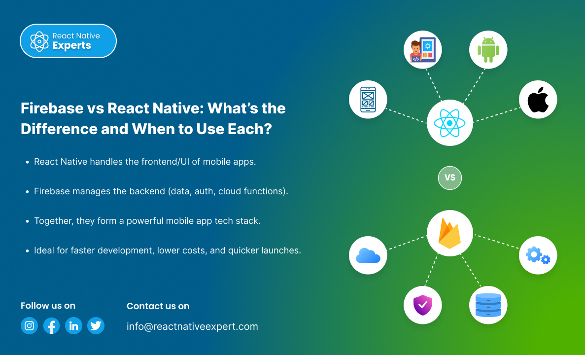
Introduction: The world of mobile app development is advancing quickly, and the phrases Firebase vs React Native should not be new to you. They sound alike at first, but in reality, they have complex distinctions that serve different functions. In this article, we will explore the core functions of each tool, their usages in the […]
React native Experts

Introduction: In today’s mobile app landscape, real-time navigation, detailed mapping, and location intelligence are more than just features—they are core to user experience in apps like ride-hailing, logistics, food delivery, and travel. While Google Maps is a popular choice, HERE Technologies offers a powerful and flexible SDK that gives developers advanced control over maps, routing, […]
React native Experts
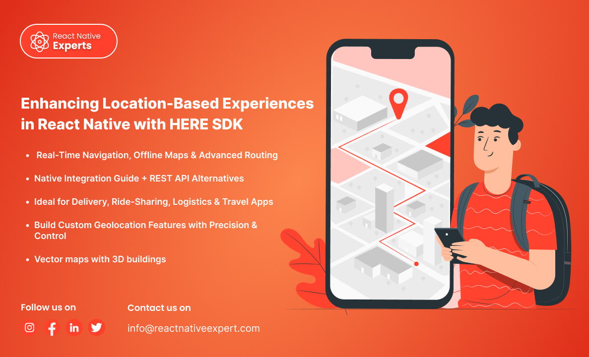
Introduction: In today’s mobile app landscape, real-time navigation, detailed mapping, and location intelligence are more than just features—they are core to user experience in apps like ride-hailing, logistics, food delivery, and travel. While Google Maps is a popular choice, HERE Technologies offers a powerful and flexible SDK that gives developers advanced control over maps, routing, […]
React native Experts

Introduction: In-app navigation has evolved from simple direction lines on maps to full-fledged systems with voice-guided turn-by-turn navigation, real-time traffic awareness, offline capabilities, and custom UI controls. For React Native developers, Mapbox emerges as a robust and highly customizable alternative to Google Maps, especially for applications that need more design freedom or offline functionality. In […]
React native Experts

Introduction Fantasy sports have transformed from being an online game into a full-fledged platform with advanced features that attracts thousands of players around the world. Current fantasy sports apps are equipped with various features, including live updates, real-time scoring, advanced analytics, immersive user experiences, and many more. Since the competition in the fantasy gaming world […]
React native Experts
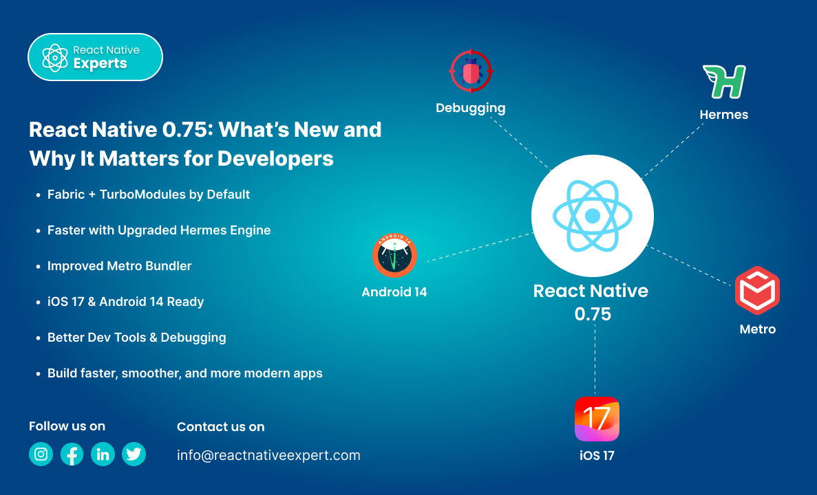
Introduction: React Native is one of the most popular frameworks for building mobile apps using a single codebase. With each new release, it gets more stable, powerful, and performance-oriented. React Native 0.75 is no different—it brings meaningful updates aimed at improving developer experience, performance, and compatibility with the latest mobile platforms. In this article, we’ll […]
React native Experts

Introduction: React Native has been a game-changer for cross-platform mobile development, enabling developers to build apps for iOS and Android with a single codebase using JavaScript and React. Over the years, React Native has continuously evolved to improve performance, scalability, and developer experience. Two major improvements that promise to significantly enhance performance and offer better […]
React native Experts
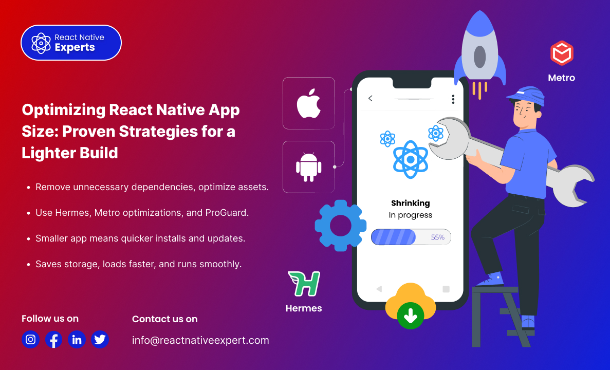
Introduction: One of the biggest challenges in mobile app development is keeping the app size minimal while maintaining performance and functionality. A large app size can lead to higher download times, increased storage usage, and poor user experience—ultimately affecting retention rates. React Native apps, by default, include various dependencies, assets, and libraries that can bloat […]
React native Experts

Introduction: Performance and UI consistency are crucial in mobile app development. A well-optimized UI can significantly impact user engagement, retention, and overall app success. When building React Native applications, achieving both high performance and a beautiful UI can be challenging due to unnecessary re-renders, inefficient style processing, and layout shifts. This is where Gluestack UI […]
React native Experts

Introduction: Testing is an essential part of mobile app development, ensuring that applications are stable, reliable, and function as expected. In the React Native ecosystem, there are numerous testing tools available for various sorts of testing, including unit testing, integration testing, and end-to-end testing. Jest is the greatest of these tools since it is quick, […]
React native Experts

Introduction: Storybook is a powerful tool that enables developers to build UI components in isolation, making UI development, testing, and documentation much easier. In React Native, Storybook helps visualize different states of a component without running the entire app. This blog provides a complete guide on setting up and using Storybook with React Native. This […]
React native Experts

Introduction: Developing a successful mobile application is more than writing code; it’s also focusing on values such as user experience. That is where Pendo and React Native contribute. While Pendo enables user behavioral analytics, feedback collection, and in-app support documentation without the need for additional coding, React Native allows developers to create applications that function […]
React native Experts
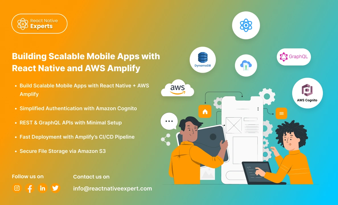
Introduction: In today’s fast-paced digital world, building scalable, feature-rich mobile applications is no longer a luxury—it’s a necessity. However, developing such apps can be challenging, especially when it comes to managing backend infrastructure, authentication, and real-time data synchronization. Enter React Native and AWS Amplify, two powerful tools that, when combined, can help you build robust, […]
React native Experts

Introduction Businesses today want mobile apps that launch faster, cost less to maintain, and work smoothly across Android and iOS devices. At the same time, user expectations continue increasing. People expect: Fast app performance Seamless user experiences Frequent updates Real-time functionality Consistent design across devices This is one of the biggest reasons why React Native […]
React native Experts
Introduction More than one billion people use mobile applications on a regular basis. With a plethora of mobile applications available to consumers, businesses search for mobile apps that aid in streamlining business operations. With the ability to develop any mobile application, React Native app development services make it possible to build apps quickly and at […]
React native Experts

Introduction In today’s mobile-first world, businesses need applications that can reach users across multiple devices and operating systems without significantly increasing development costs. Cross platform app development services enable companies to build high-quality mobile applications that run seamlessly on both iOS and Android using a single codebase. This approach accelerates development, reduces maintenance efforts, and […]
React native Experts
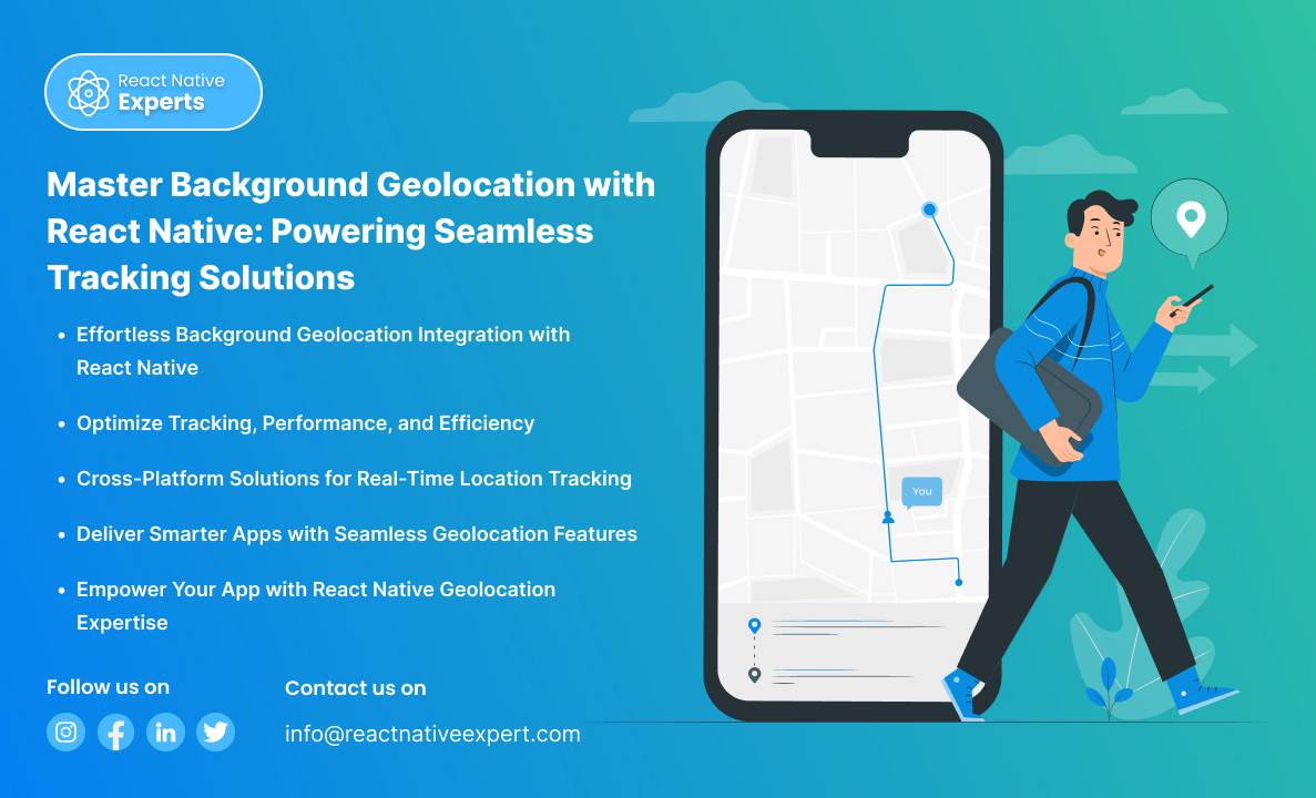
What is Background Geolocation? Background geolocation is a function within a mobile application that enables tracking of the users’ location when an app runs in the background. It is pertinent to applications such as delivery service systems, fitness trackers, transportation and logistics management systems. For example, background geolocation integration with React Native is seamless with […]
React native Experts

Introduction If you are looking to develop interactive mobile apps, React Native is the best solution. Not only can developers create high-quality touch-based UIs, but they are also able to enhance the usability of the app’s interactivity features. It also consists of a very useful library called ‘React Native Gesture Handler’ that allows the creation […]
React native Experts
Introduction Cross-platform app development has evolved from a cost-saving alternative into a strategic business decision. In 2026, organizations are no longer asking whether cross-platform frameworks can deliver high-quality mobile experiences. Instead, they are evaluating which framework provides the best balance of performance, scalability, development speed, and long-term maintainability. As mobile applications become increasingly central to […]
React native Experts
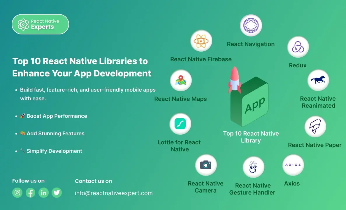
Introduction React Native is a powerful framework that allows developers to build mobile apps for iOS and Android using a single codebase. Its growing popularity is supported by a vibrant community and numerous libraries that make app development faster, easier, and more efficient. If you’re looking to create a high-performing mobile app, leveraging the right […]
React native Experts
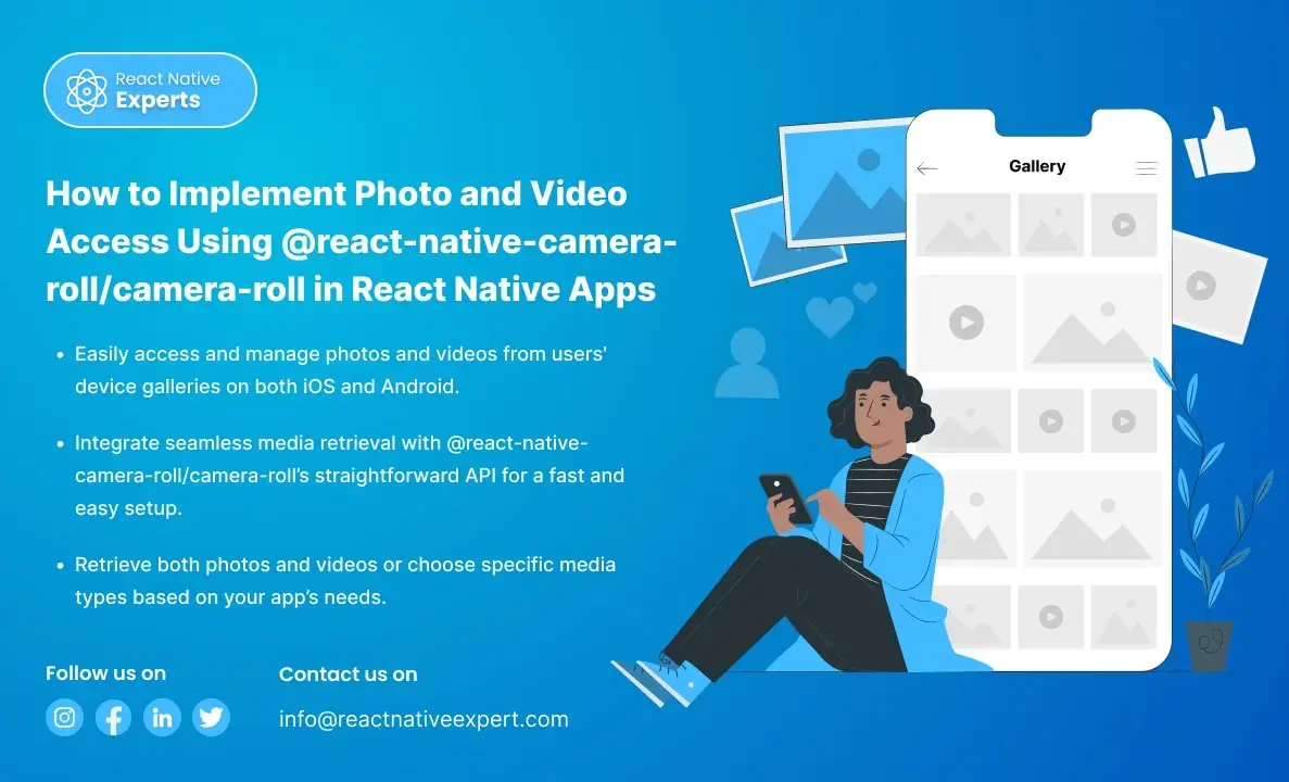
Introduction When building a React Native app that requires users to access photos or videos from their device’s gallery, integrating the @react-native-camera-roll/camera-roll library is a great solution. This library provides an easy way to access and manage the media on the user’s device. In this article, we’ll walk through the steps to implement photo and […]
React native Experts

Introduction to Implement OTP Verification in React Native Apps In today’s digital world, security is essential, and OTP (One-Time Password) verification is a highly effective way to protect users’ accounts in mobile apps. It ensures that only authorized users can access their accounts by sending a unique code to their devices. In this article, we’ll […]
React native Experts

Introduction to React Native React Native is a powerful open-source framework that developers use to build mobile apps for iOS and Android using JavaScript and a single codebase. Building a React Native app with video playback is common for eLearning platforms, OTT apps, fitness solutions, social media products, and internal training tools. The most widely […]
React native Experts

Unlock the power of Google Play Console to manage apps, analyze performance, and reach a global audience with powerful insights and tools.
React native Experts
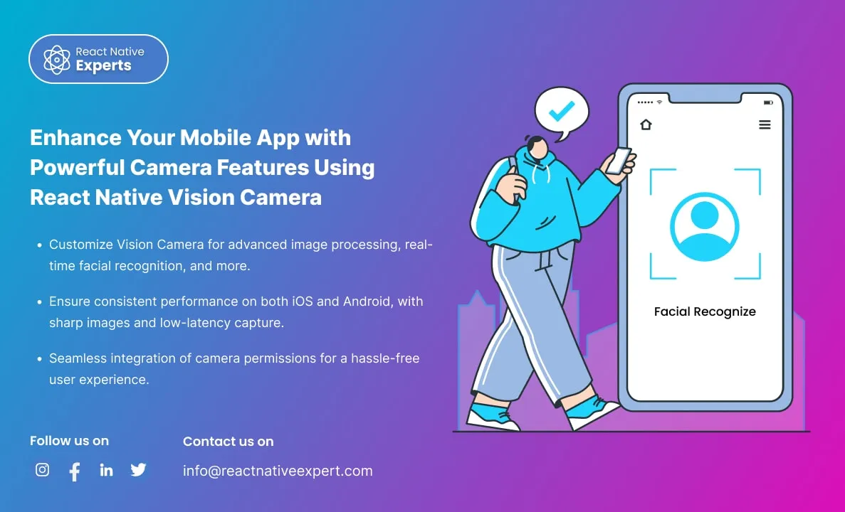
Introduction: In today’s mobile-first world, where smartphone applications are an integral part of our daily lives, ensuring that your app delivers an intuitive and powerful camera experience is paramount. Imagine this scenario: a user downloads your app, eager to capture a moment, but is met with a clunky camera interface or, worse, poor image quality. […]
React native Experts
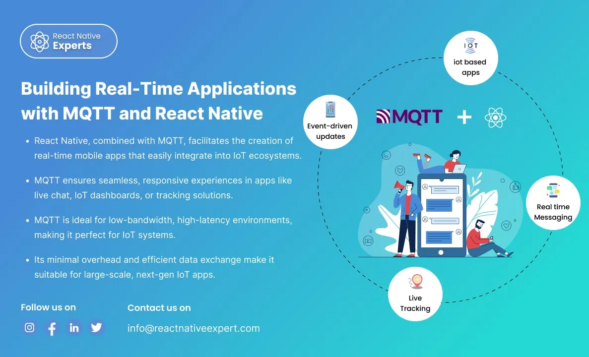
Introduction: In the fast-paced world of mobile app development, real-time communication is essential. One of the most effective ways to achieve this is by integrating MQTT (Message Queuing Telemetry Transport) with React Native. MQTT is a lightweight messaging protocol designed for real-time communication, particularly in environments with limited bandwidth or high latency. This blog will […]
React native Experts
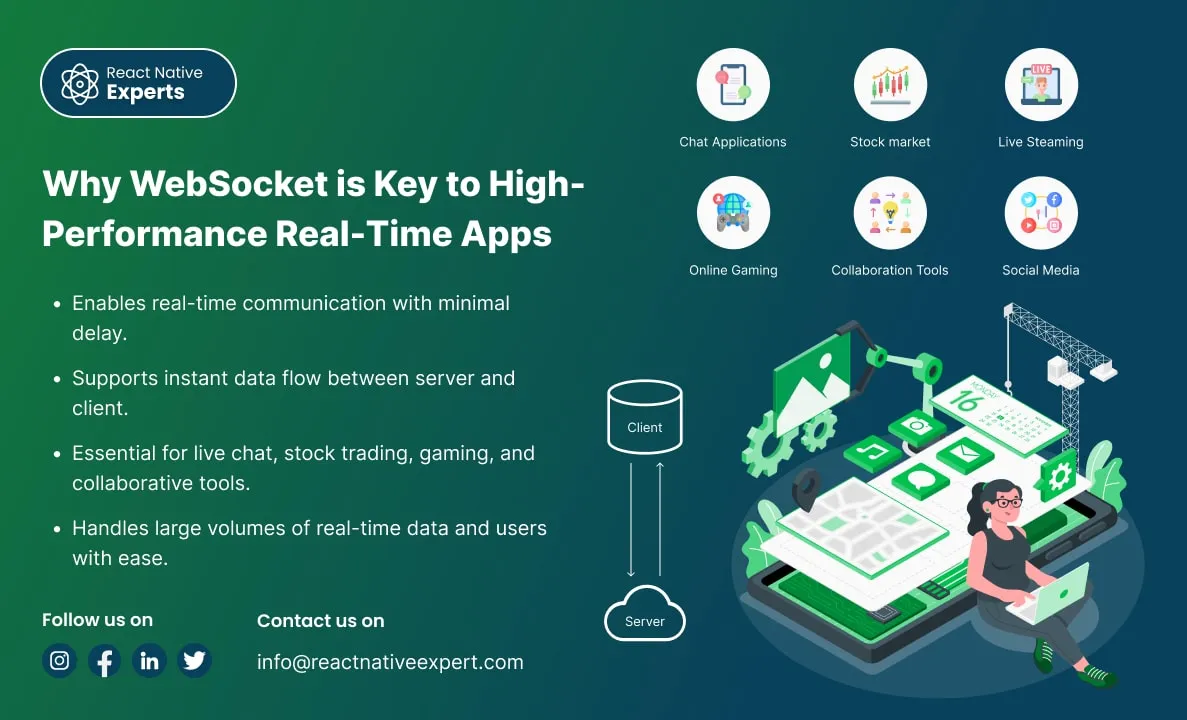
Introduction: In today’s digital age, users expect real-time updates, instant notifications, and seamless communication across devices. Whether it’s chatting with friends, collaborating on documents, or following stock market trends, the need for instantaneous data exchange has become crucial. Traditional HTTP-based systems often struggle to meet these real-time expectations due to inherent limitations in how they […]
React native Experts

Introduction: Unity is a powerful game engine widely used to create immersive 2D and 3D experiences, while React Native is a popular framework for building cross-platform mobile applications using JavaScript. Integrating Unity with React Native allows developers to enhance mobile apps with advanced 3D graphics, augmented reality (AR), and virtual reality (VR) capabilities while maintaining […]
React native Experts
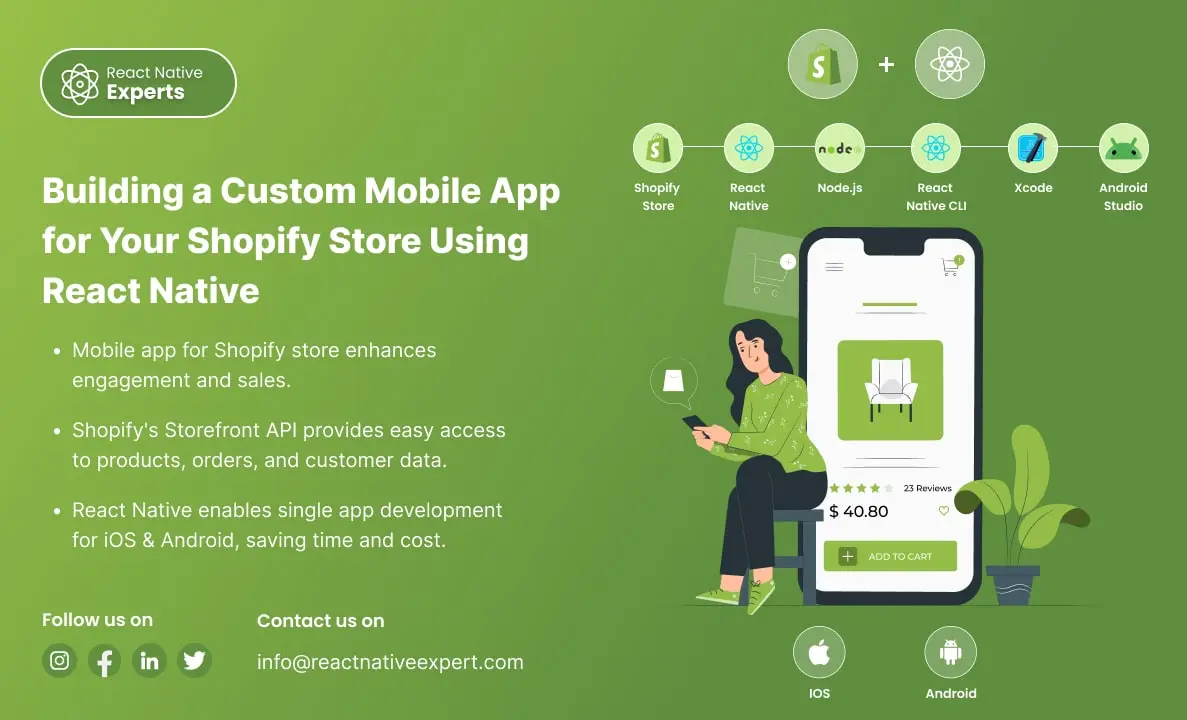
Introduction: Shopify Mobile App with React Native is a powerful solution as mobile commerce continues to rise. Businesses must cater to their customers’ preferences for seamless, user-friendly shopping experiences. Shopify, a leading e-commerce platform, empowers businesses to set up online stores effortlessly. However, the user experience can be elevated further through a mobile app. With […]
React native Experts
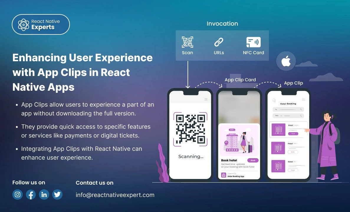
Introduction: App Clips provides a revolutionary way for users to experience a small part of your app without downloading the full version. Apple’s App Clips, introduced in iOS 14, are designed to offer users a streamlined way to interact with an app without requiring them to install it fully. With App Clips, you can offer […]
React native Experts
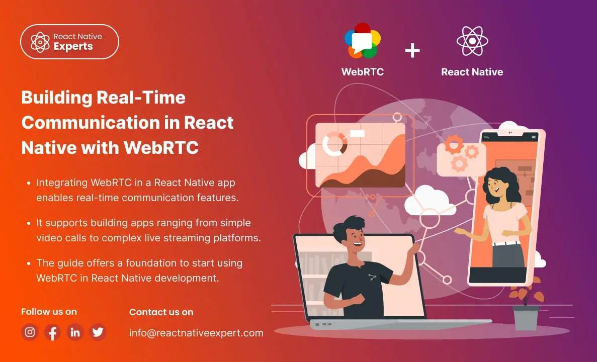
Introduction: In an era where real-time communication is crucial for the success of many applications, WebRTC (Web Real-Time Communication) emerges as a powerful tool that enables peer-to-peer audio, video, and data sharing within browsers and mobile applications. This blog will dive deep into how you can leverage WebRTC in React Native to build feature-rich communication […]
React native Experts

Introduction: React Native has transformed mobile app development by enabling developers to build cross-platform applications using a single JavaScript codebase. While it covers most common use cases out of the box, some advanced device capabilities and performance-intensive features still require direct access to native APIs. This is where native modules in React Native play a […]
React native Experts
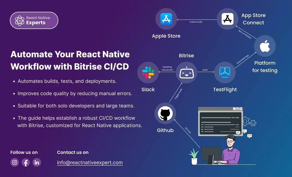
Introduction: In today’s fast-paced development environment, Continuous Integration (CI) and Continuous Deployment (CD) are essential for delivering high-quality software quickly. Bitrise is a leading CI/CD platform tailored for mobile apps, offering seamless integration with React Native. This blog will walk you through the process of setting up Bitrise for a React Native project, including code […]
React native Experts
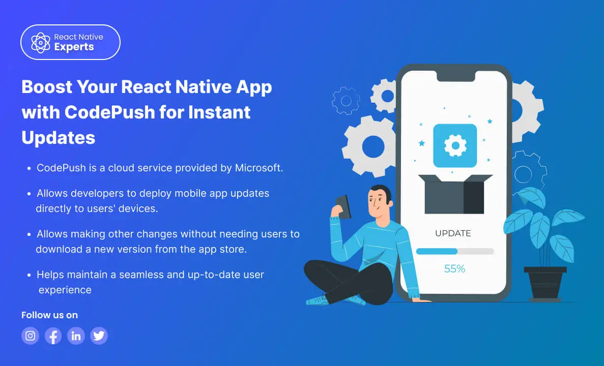
https://reactnativeexpert.com/wp-content/uploads/2024/07/Codepush.mp4#t=1 Introduction: CodePush is a cloud service from Microsoft that enables React Native developers to deploy mobile app updates directly to their users’ devices. This bypasses the traditional app store update process, providing a seamless way to fix bugs, add features, and make other changes without the need for users to download a new version […]
React native Experts
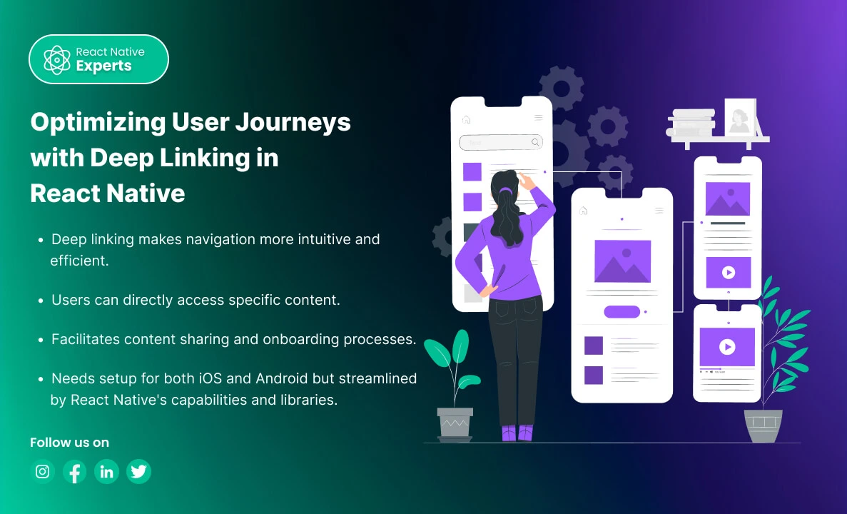
Introduction: Deep linking is a powerful feature in mobile applications that allows users to navigate to specific content within an app through a URL. In React Native, implementing deep linking can enhance user experience by providing direct access to specific parts of your app from emails, messages, social media, or other apps. This blog will […]
React native Experts
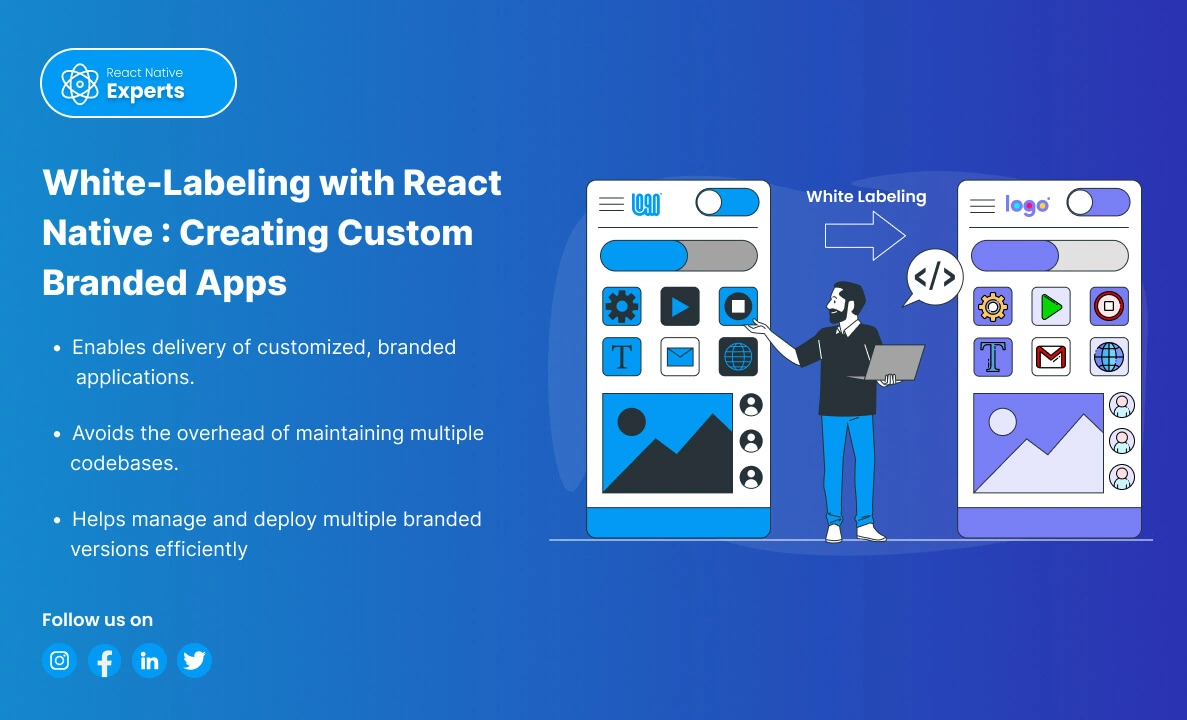
Introduction: White-labeling is a process where a product or service produced by one company is rebranded by another company to make it appear as its own. In the context of mobile applications, white labeling allows businesses to customize an app’s appearance and functionality to match their brand without developing an app from scratch. React Native, […]
React native Experts
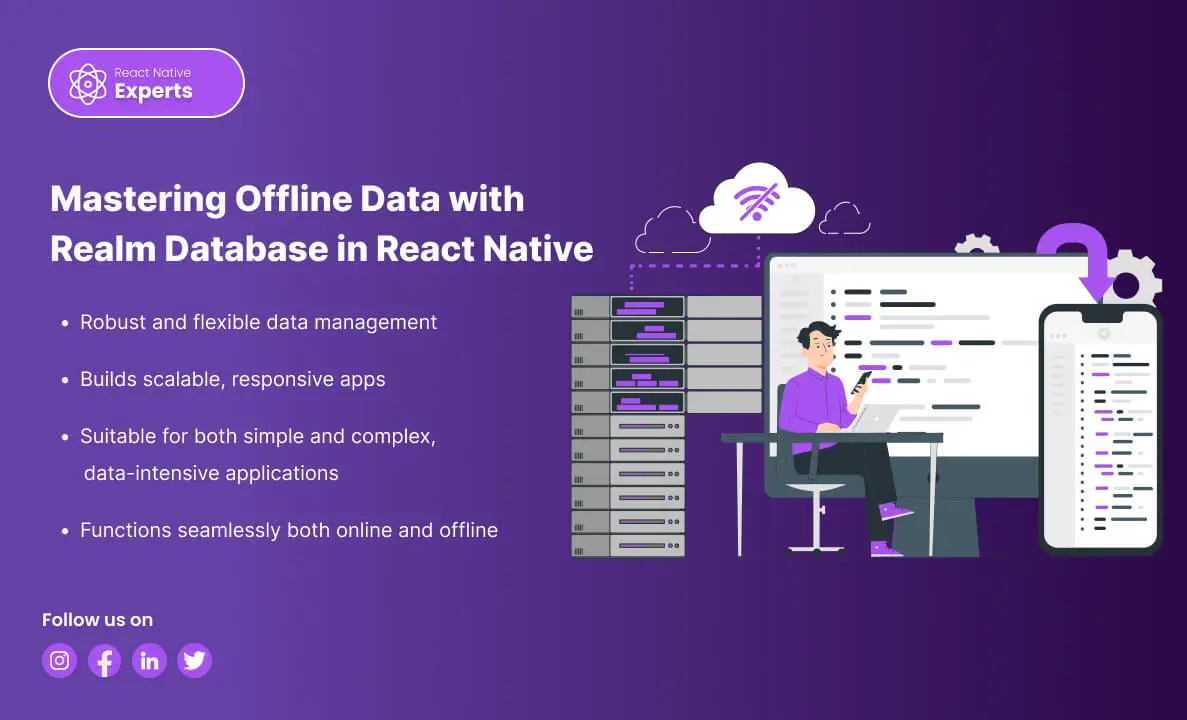
Introduction: In the dynamic landscape of mobile development, efficient data handling is paramount for creating high-performance applications. Realm Database stands out as a powerful solution for React Native developers, offering a blend of speed, simplicity, and offline capabilities. In this blog, we’ll explore why Realm is a top choice, how to manage offline data in […]
React native Experts

Introduction: When building mobile applications, managing data efficiently and ensuring offline capabilities are critical to delivering a smooth user experience. SQLite Database is a reliable and powerful choice for React Native developers. This blog will cover why SQLite is a top choice, how it facilitates offline data management, setup instructions (with description and query examples), […]
React native Experts
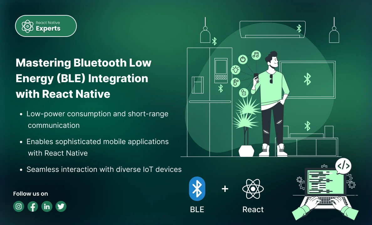
Introduction: In the realm of modern mobile applications, Bluetooth Low Energy (BLE) stands out as a crucial technology for enabling efficient, wireless communication between devices. Whether you’re developing health monitors, smart home gadgets, or industrial IoT solutions, understanding how to integrate BLE with React Native can significantly enhance your app’s capabilities. This professional blog explores […]
React native Experts
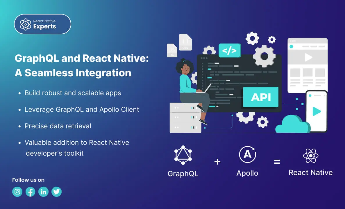
Introduction: GraphQL has emerged as a powerful tool for querying APIs, providing an efficient and flexible alternative to REST. When combined with React Native, it can significantly enhance mobile app development. In this blog, we’ll explore what GraphQL is, why it’s beneficial for React Native, how to connect it with a React Native app, and […]
React native Experts

Introduction: As mobile commerce continues to grow, integrating secure and efficient payment methods into your app becomes crucial. Apple Pay and Google Pay are two leading digital wallets that offer users a seamless payment experience. This guide explores why you should integrate these payment options into your React Native app, how to do it, and […]
React native Experts

Introduction: In today’s digital era, seamless Payment Solutions and secure payment processing are essential for the success of any mobile application that involves financial transactions. Integrating a payment gateway into your React Native app can greatly enhance user experience, security, and trust. This blog will explore why you should use a payment gateway and when […]
React native Experts

Introduction: In today’s fast-paced digital landscape, businesses need to quickly develop and deploy applications to stay ahead of the competition. Combining the low-code development capabilities of Mendix with the powerful mobile framework React Native can significantly accelerate the development process. This blog will explore what Mendix is, how to work with it, how to connect […]
React native Experts

Introduction: React Native has become a go-to framework for building sleek and responsive mobile apps. But what if you want to add that extra layer of interactivity—real-time updates, live data feeds, or instant messaging? That’s where Socket.IO comes in, and React Native experts can leverage its power to create truly engaging user experiences. What is […]
React native Experts

Introduction: Building mobile apps, especially with React Native, is fantastic! You can create beautiful, native-feeling apps for both Android and iOS with a single codebase. But even the most talented React Native developers know that debugging these apps can be a real challenge. Imagine a user happily browsing your app when suddenly it crashes. Frustrated, […]
React native Experts
Introduction: Today, many people and businesses want to create mobile apps for various reasons, like personal projects, brand visibility, or business growth. For businesses, finding the most cost-effective and efficient way to develop apps is crucial, especially since the demand for mobile apps is continuously growing. In 2022, users worldwide downloaded 255 billion mobile apps, […]
React native Experts
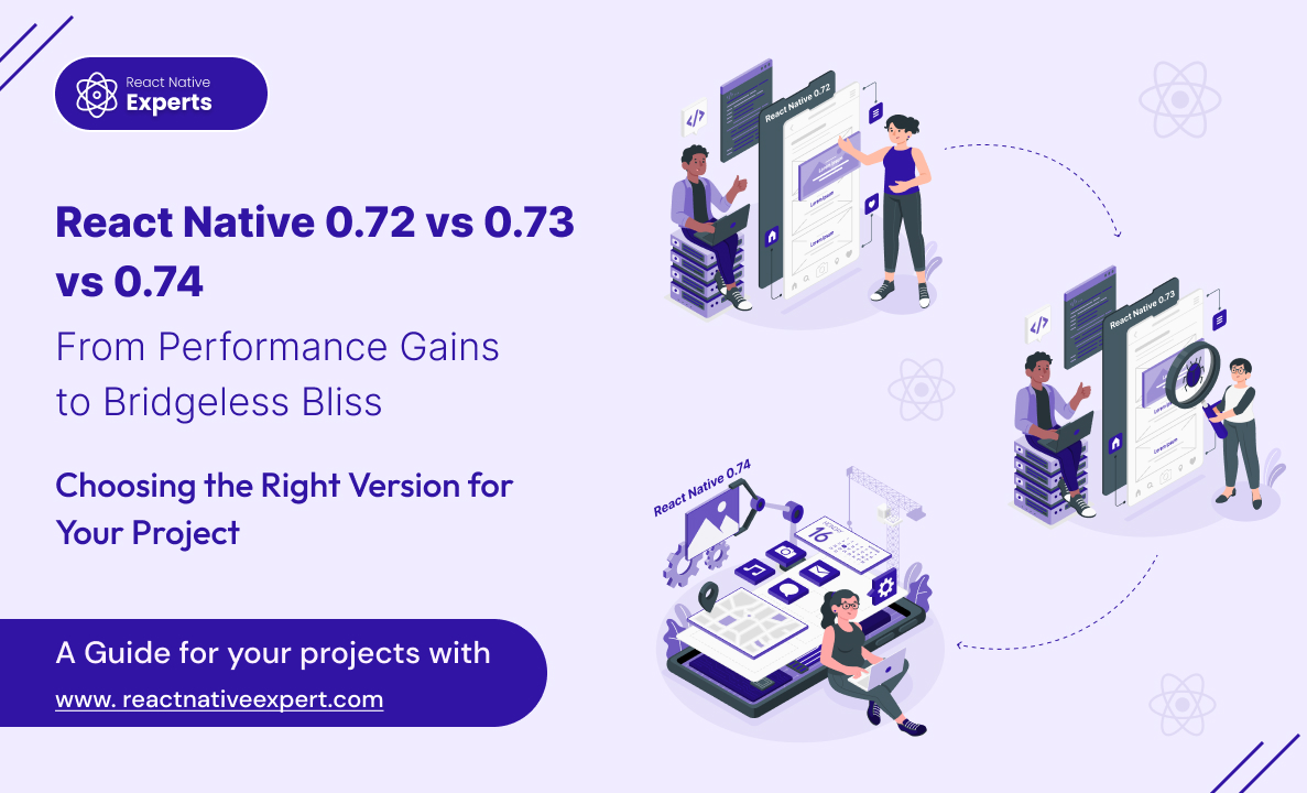
Introduction: React Native continues to evolve rapidly, empowering React Native experts to build even more performant and efficient mobile apps. Keeping up with the latest releases is crucial for staying ahead of the curve. ‘React Native 0.72 vs 0.73 vs 0.74’, In this blog post dive into the key differences between React Native Versions 0.72, […]
React native Experts
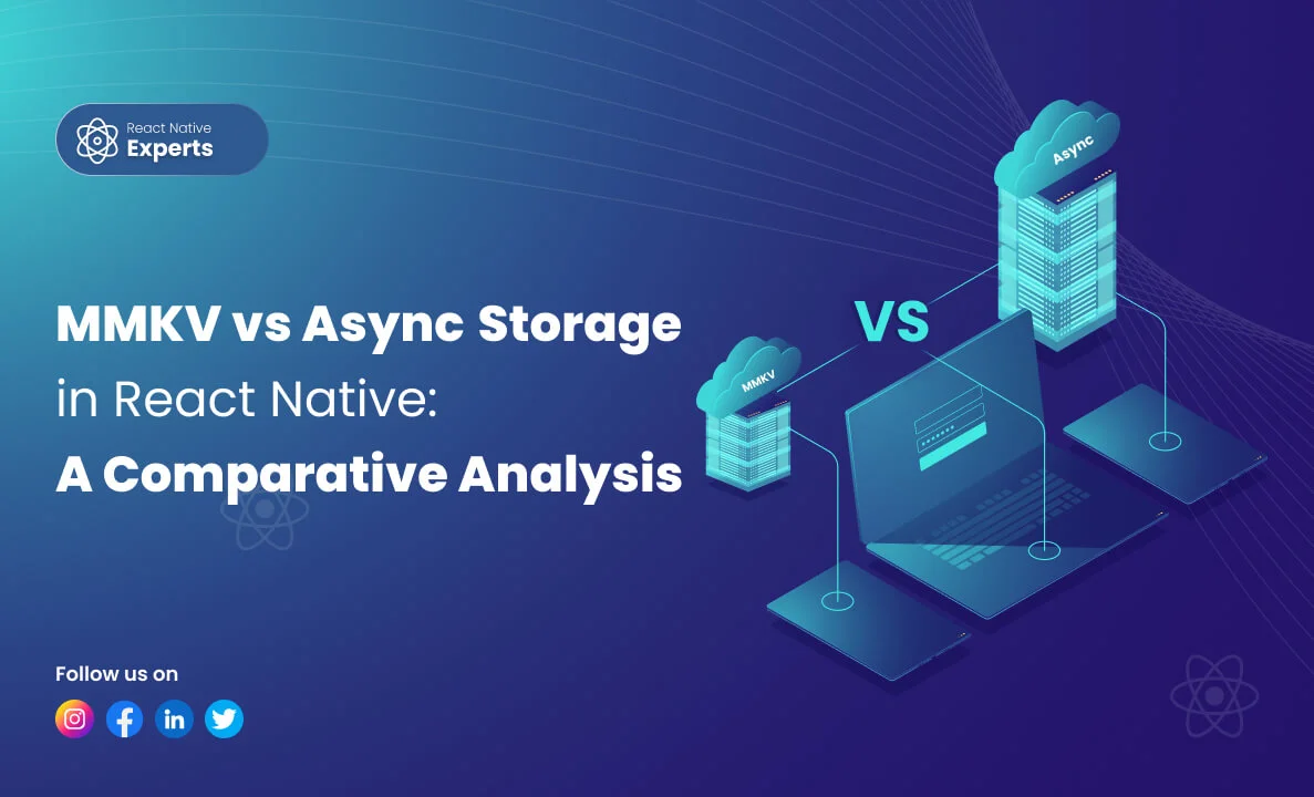
Introduction: React Native developers often face the dilemma of choosing the right storage solution for their applications. Two popular options for storing data are MMKV and AsyncStorage. In this article, ‘MMKV vs AsyncStorage in react native’, we’ll conduct a comparative analysis of these two libraries to help you make an informed decision based on your project […]
React native Experts

Introduction: Mobile users expect apps to work instantly. They do not want slow loading screens, confusing navigation, laggy performance, or apps that drain battery life. Whether it is ecommerce, healthcare, SaaS, logistics, or social platforms, mobile experience now directly affects user retention and business growth. That is why mastering mobile optimization has become one of […]
React native Experts

Introduction: In the ever-evolving landscape of mobile application development, React Native emerges as a beacon of innovation, driving the evolution of cross-platform solutions. With the release of React Native 0.73, developers and businesses witness a transformative update, enhancing capabilities and redefining the developer experience. This article delves into the evolution of React Native, highlighting the […]
React native Experts

Introduction: In the digital age, e-commerce has become a cornerstone of the retail industry, and mobile commerce (m-commerce) is rapidly gaining ground. With consumers increasingly turning to their smartphones for shopping, businesses are looking for efficient ways to capture this growing market. Enter React Native – the open-source framework that is revolutionizing the way e-commerce […]
React native Experts

Introduction: Devin AI vs. React Native Experts, Let’s delve into the intriguing comparison between React Native experts and Devin AI, the world’s first fully autonomous AI software engineer. As a React Native developer, you’re likely curious about the capabilities of Devin and how it stacks up against human expertise. Buckle up as we explore this fascinating topic! […]
React native Experts

Introduction: For startups, speed and smart spending can decide survival. Building separate apps for iOS and Android often drains time, money, and team energy before product-market fit is even clear. That’s where React Native becomes powerful. With a single codebase, startups can launch on multiple platforms, validate ideas with real users, and iterate fast without […]
React native Experts

Introduction: In the dynamic landscape of mobile app development, staying ahead of the curve is not just a goal but a necessity. As we step into 2026, React Native stands tall as a cornerstone technology, offering unparalleled flexibility, performance, and scalability. In this blog, we’ll take a deep dive into the top React Native development […]
React native Experts

Introduction: Business growth with React Native is becoming a strategic advantage for startups and enterprises aiming to launch mobile applications quickly, reduce costs, and reach wider audiences. By enabling cross-platform development with a single codebase, React Native helps businesses accelerate digital transformation and improve time-to-market. In the current competitive environment, companies that adopt effective mobile […]
React native Experts

Introduction: Building a mobile app that is fast, scalable, and cost-effective requires the right technology and the right team. This is why many businesses choose to hire React Native experts for their mobile app development needs. With React Native, companies can build apps for both Android and iOS using a single codebase, reducing development time […]
React native Experts

Introduction: React Native Apps have transformed the mobile development market by allowing developers to construct high-quality, cross-platform applications with unprecedented efficiency. As we progress through 2026, React Native’s influence grows across a wide spectrum of applications that are transforming the digital world. From social media behemoths like Instagram and Facebook, which continue to set new […]
React native Experts

Introduction: In the fast-paced world of mobile app creation, React Native is like a superhero, changing the game and making app development an exciting adventure. With its ability to craft robust and dynamic applications for both iOS and Android platforms, React Native has become the go-to choice for developers and businesses alike. As React Native […]
React native Experts

Introduction: In the rapidly changing world of mobile apps, finding the right technology for your project is key. Of all the alternatives on offer, React Native is one of the best cross-platform options available to businesses. If you’re thinking of leveraging the awesomeness that is React Native, then choosing the right development partner will be crucial for your […]
React native Experts

Introduction: In the dynamic world of mobile app development, React Native stands as a beacon of innovation and efficiency, weaving seamless experiences that not only captivate users but also drive sales and income. At React Native Experts, our React Native development prowess takes your unique ideas and transforms them into digital masterpieces. Let’s embark on […]
React native Experts

Introduction: Whenever we push our code in Git, we have to check code syntax issues or code styling. But we often forget these things, so how can we overcome this? The solution is to use an automated tool whenever we push our code changes in Git, it will automatically check syntax or styling issues. For […]
React native Experts

Introduction: In today’s fast-paced world of mobile development, React Native has emerged as a game-changer. This cross-platform framework enables developers to create mobile apps for both iOS and Android with a single codebase. However, like any technology, React Native apps can benefit from optimization to ensure top-notch performance. In this blog post, we’ll explore the […]
React native Experts

Introduction: In today’s fast-paced digital world, creating a seamless and captivating user experience is crucial for the success of any mobile application. React Native, a powerful framework for cross-platform mobile development, has become the go-to choice for businesses and developers looking to create high-quality apps efficiently. In this blog, we’ll delve into the world of […]
React native Experts

Introduction: Cross-platform app development continues growing rapidly in 2026. Businesses want faster launches, lower development costs, and mobile apps that work smoothly on both Android and iOS without maintaining two separate codebases. That is why frameworks like React Native and Flutter remain two of the most discussed technologies in mobile app development. But choosing between […]
React native Experts

Introduction: Fastlane stands out as a pivotal tool in the arsenal of mobile developers, providing a streamlined path for automating the build, test, and deployment processes of mobile applications. For React Native developers, incorporating Fastlane into the workflow is a game changer. It not only enhances efficiency but also ensures consistency across builds, ultimately leading […]
React native Experts

Introduction: In today’s app-driven ecosystem, monetization is a critical element for developers, and in-app purchases stand at the forefront of this drive. However, managing these purchases can be a complex endeavor. This is where RevenueCat shines. Offering a streamlined solution for in-app subscriptions and purchases, particularly for platforms like React Native, it’s becoming the go-to […]
React native Experts