


Mar 12, 2025
Save for later


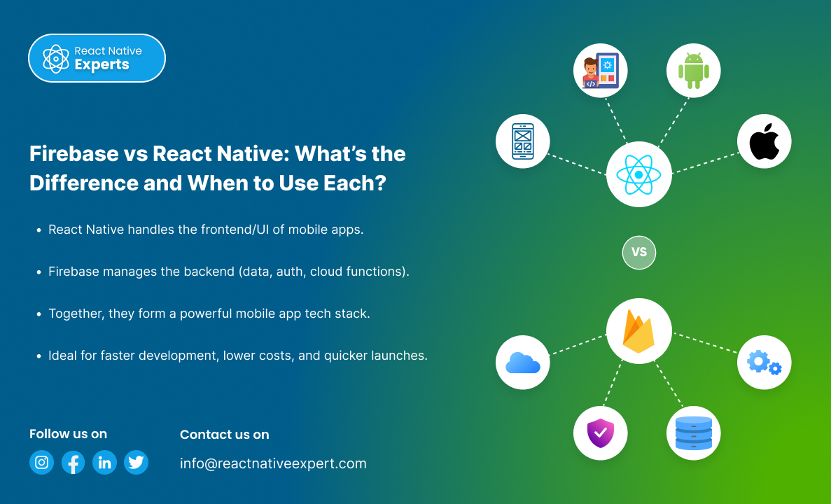
Introduction: The world of mobile app development is advancing quickly, and the phrases Firebase vs React Native should not be new to you. They sound alike at first, but in reality, they have complex distinctions that serve different functions. In this article, we will explore the core functions of each tool, their usages in the […]
 React native Experts

Introduction: In today’s mobile app landscape, real-time navigation, detailed mapping, and location intelligence are more than just features—they are core to user experience in apps like ride-hailing, logistics, food delivery, and travel. While Google Maps is a popular choice, HERE Technologies offers a powerful and flexible SDK that gives developers advanced control over maps, routing, […]
React native Experts
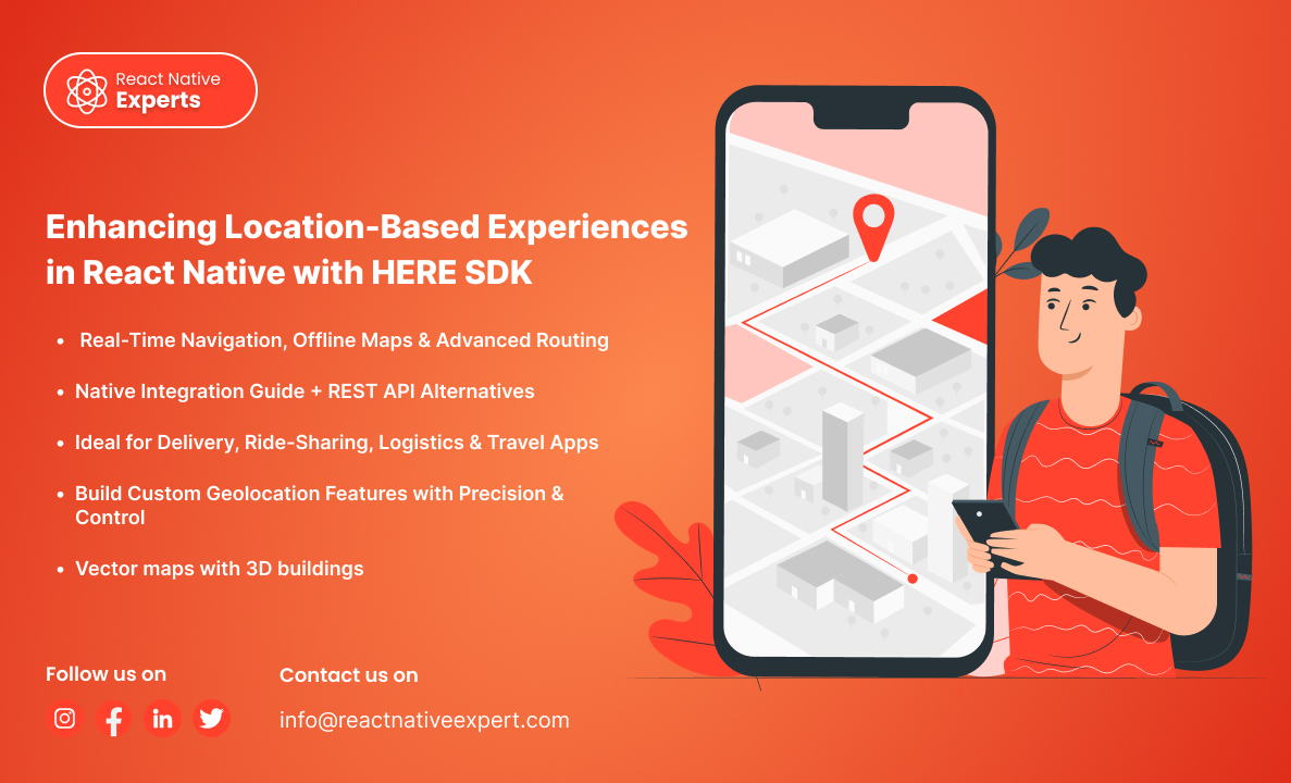

Introduction: In-app navigation has evolved from simple direction lines on maps to full-fledged systems with voice-guided turn-by-turn navigation, real-time traffic awareness, offline capabilities, and custom UI controls. For React Native developers, Mapbox emerges as a robust and highly customizable alternative to Google Maps, especially for applications that need more design freedom or offline functionality. In […]
React native Experts

Introduction Fantasy sports apps have transformed the way fans interact with sports. Users are no longer limited to just watching matches; they can now manage their own virtual teams, compete with friends, and stand to win actual rewards based on their players’ real-world performances. Fantasy sports provide extensive coverage, including cricket, football, basketball, and even […]
React native Experts
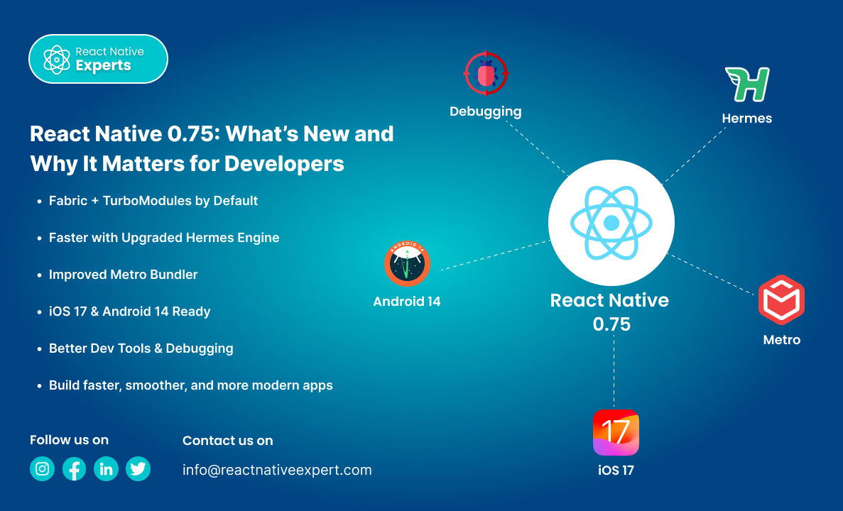
Introduction: React Native is one of the most popular frameworks for building mobile apps using a single codebase. With each new release, it gets more stable, powerful, and performance-oriented. React Native 0.75 is no different—it brings meaningful updates aimed at improving developer experience, performance, and compatibility with the latest mobile platforms. In this article, we’ll […]
React native Experts

Introduction: React Native has been a game-changer for cross-platform mobile development, enabling developers to build apps for iOS and Android with a single codebase using JavaScript and React. Over the years, React Native has continuously evolved to improve performance, scalability, and developer experience. Two major improvements that promise to significantly enhance performance and offer better […]
React native Experts

Introduction: One of the biggest challenges in mobile app development is keeping the app size minimal while maintaining performance and functionality. A large app size can lead to higher download times, increased storage usage, and poor user experience—ultimately affecting retention rates. React Native apps, by default, include various dependencies, assets, and libraries that can bloat […]
React native Experts

Introduction: Performance and UI consistency are crucial in mobile app development. A well-optimized UI can significantly impact user engagement, retention, and overall app success. When building React Native applications, achieving both high performance and a beautiful UI can be challenging due to unnecessary re-renders, inefficient style processing, and layout shifts. This is where Gluestack UI […]
React native Experts

Introduction: Testing is a critical component of software development, ensuring that applications remain stable, reliable, and perform as expected. In the React Native ecosystem, numerous testing tools cater to different testing needs, including unit testing, integration testing, and end-to-end testing. Among these tools, Jest stands out as the best choice due to its speed, ease […]
React native Experts

Introduction: Developing a successful mobile application is more than writing code; it’s also focusing on values such as user experience. That is where Pendo and React Native contribute. While Pendo enables user behavioral analytics, feedback collection, and in-app support documentation without the need for additional coding, React Native allows developers to create applications that function […]
React native Experts
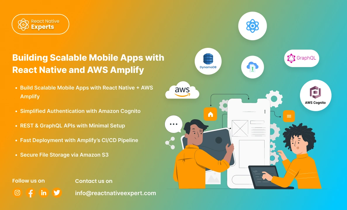
Introduction: In today’s fast-paced digital world, building scalable, feature-rich mobile applications is no longer a luxury—it’s a necessity. However, developing such apps can be challenging, especially when it comes to managing backend infrastructure, authentication, and real-time data synchronization. Enter React Native and AWS Amplify, two powerful tools that, when combined, can help you build robust, […]
React native Experts

Introduction Mobile app development is changing at a greater pace, with 2025 looking like the year of revolution. As there is increasing demand from businesses to have faster and more scalable solutions at affordable prices, React Native still remains the preferred framework for cross-platform development. If you are a startup or an established enterprise, selecting […]
React native Experts

Introduction In a world where mobile apps dominate, businesses need powerful and efficient solutions to stand out. React Native app development services offer a modern, cost-effective way to create high-quality mobile applications that deliver a seamless experience. Whether you’re a small startup or a large enterprise, React Native can help you build apps that not […]
React native Experts

Introduction In today’s digital environment, creating a mobile app is critical for engaging with your target audience. However, designing separate apps for iOS and Android can be costly and time-consuming. This is where cross-platform app development comes in. Businesses can use sophisticated tools like React Native to create high-quality apps with a single codebase, saving […]
React native Experts

What is Background Geolocation? Background geolocation is a function within a mobile application that enables tracking of the users’ location when an app runs in the background. It is pertinent to applications such as delivery service systems, fitness trackers, transportation and logistics management systems. For example, background geolocation integration with React Native is seamless with […]
React native Experts

Introduction If you are looking to develop interactive mobile apps, React Native is the best solution. Not only can developers create high-quality touch-based UIs, but they are also able to enhance the usability of the app’s interactivity features. It also consists of a very useful library called ‘React Native Gesture Handler’ that allows the creation […]
React native Experts
Introduction In the fast-paced world of technology, businesses are constantly looking for ways to build high-quality mobile apps efficiently and cost-effectively. Cross-platform app development has emerged as a solution to address these needs, and React Native stands out as a leading framework in this space. With its powerful features and extensive capabilities, React Native has […]
React native Experts
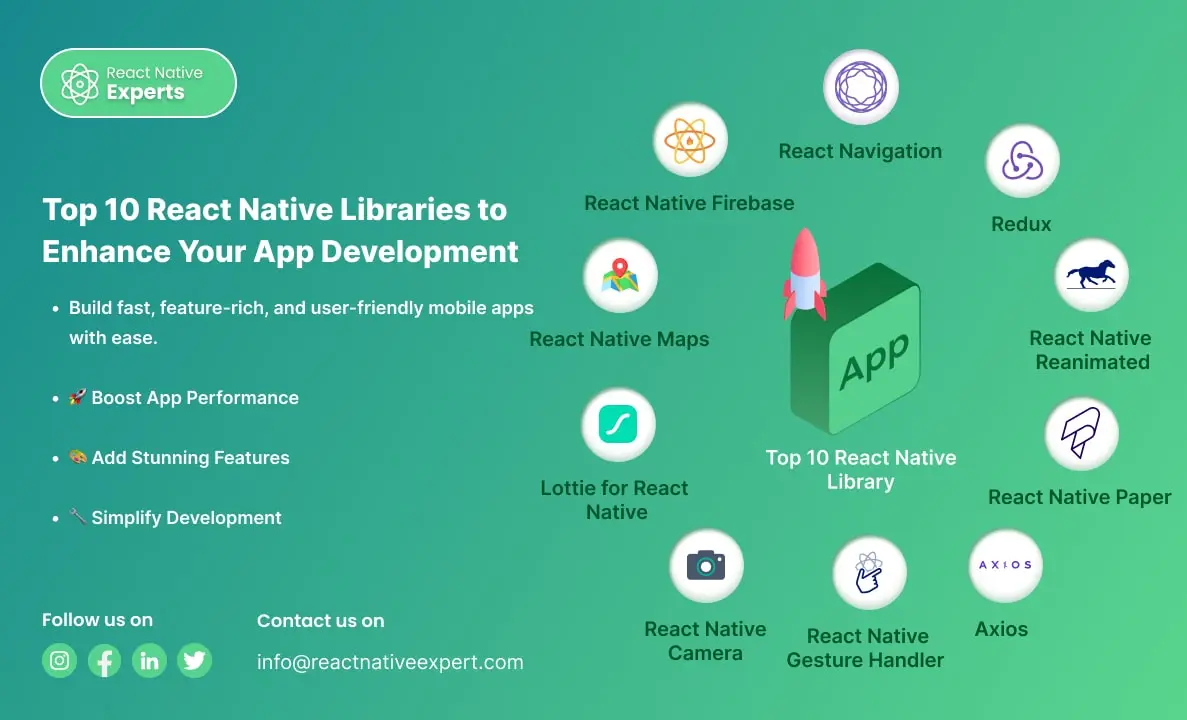
Introduction React Native is a powerful framework that allows developers to build mobile apps for iOS and Android using a single codebase. Its growing popularity is supported by a vibrant community and numerous libraries that make app development faster, easier, and more efficient. If you’re looking to create a high-performing mobile app, leveraging the right […]
React native Experts
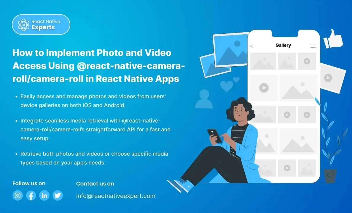
Introduction When building a React Native app that requires users to access photos or videos from their device’s gallery, integrating the @react-native-camera-roll/camera-roll library is a great solution. This library provides an easy way to access and manage the media on the user’s device. In this article, we’ll walk through the steps to implement photo and […]
React native Experts

Introduction to Implement OTP Verification in React Native Apps In today’s digital world, security is essential, and OTP (One-Time Password) verification is a highly effective way to protect users’ accounts in mobile apps. It ensures that only authorized users can access their accounts by sending a unique code to their devices. In this article, we’ll […]
React native Experts

Introduction to React Native React Native is a powerful open-source framework that lets developers build mobile apps for iOS and Android using JavaScript and a single codebase. By blending React’s interface-building capabilities with native components and integrating tools like react-native-video, developers can create high-performance apps with engaging multimedia features and faster development cycles. Incorporating video […]
React native Experts

Unlock the power of Google Play Console to manage apps, analyze performance, and reach a global audience with powerful insights and tools.
React native Experts
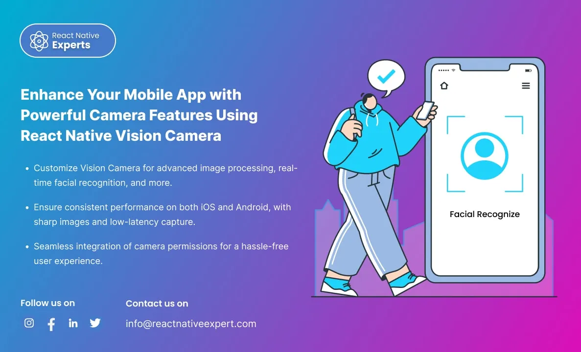
Introduction: In today’s mobile-first world, where smartphone applications are an integral part of our daily lives, ensuring that your app delivers an intuitive and powerful camera experience is paramount. Imagine this scenario: a user downloads your app, eager to capture a moment, but is met with a clunky camera interface or, worse, poor image quality. […]
React native Experts

Introduction: In the fast-paced world of mobile app development, real-time communication is essential. One of the most effective ways to achieve this is by integrating MQTT (Message Queuing Telemetry Transport) with React Native. MQTT is a lightweight messaging protocol designed for real-time communication, particularly in environments with limited bandwidth or high latency. This blog will […]
React native Experts
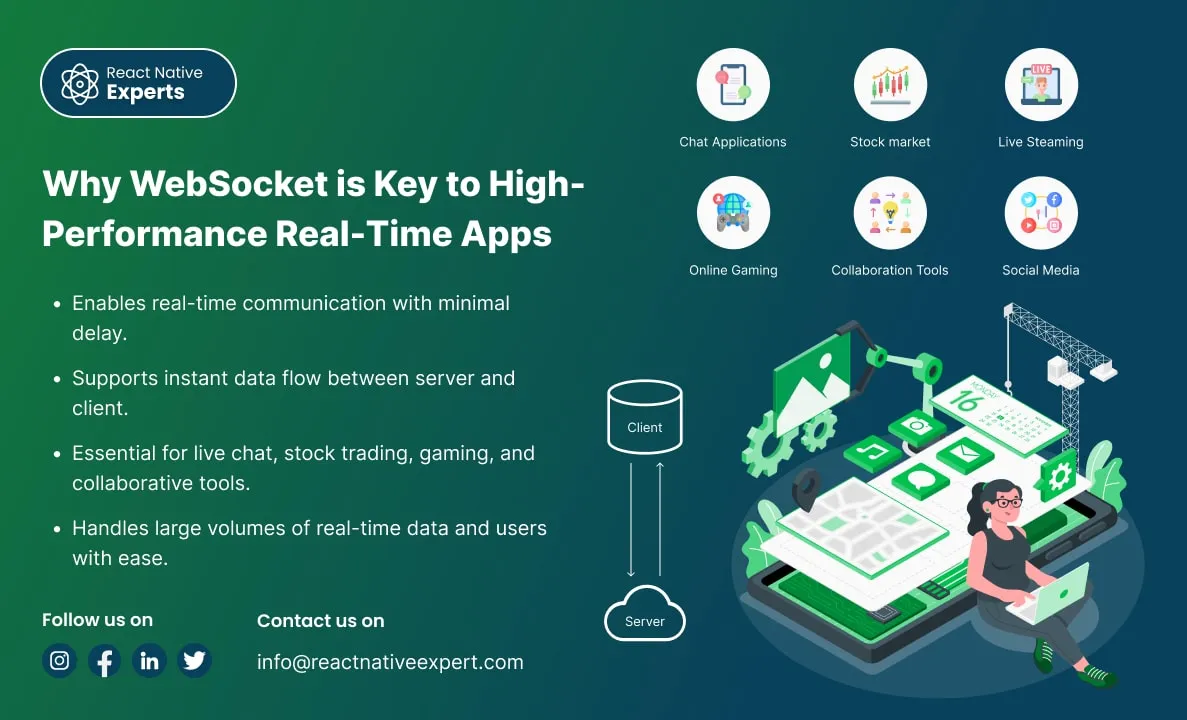
Introduction: In today’s digital age, users expect real-time updates, instant notifications, and seamless communication across devices. Whether it’s chatting with friends, collaborating on documents, or following stock market trends, the need for instantaneous data exchange has become crucial. Traditional HTTP-based systems often struggle to meet these real-time expectations due to inherent limitations in how they […]
React native Experts

Introduction: Unity is a powerful game engine widely used to create immersive 2D and 3D experiences, while React Native is a popular framework for building cross-platform mobile applications using JavaScript. Integrating Unity with React Native allows developers to enhance mobile apps with advanced 3D graphics, augmented reality (AR), and virtual reality (VR) capabilities while maintaining […]
React native Experts

Introduction: Shopify Mobile App with React Native is a powerful solution as mobile commerce continues to rise. Businesses must cater to their customers’ preferences for seamless, user-friendly shopping experiences. Shopify, a leading e-commerce platform, empowers businesses to set up online stores effortlessly. However, the user experience can be elevated further through a mobile app. With […]
React native Experts

Introduction: React Native Paper is a popular UI framework that makes it simple for developers to design user interfaces that are highly dynamic, visually beautiful, and consistent. It provides an extensive collection of pre-designed elements, such as buttons, cards, dialogs, and more, and is based on Google’s Material Design principles. This enables developers to concentrate […]
React native Experts
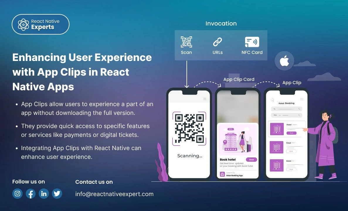
Introduction: App Clips provides a revolutionary way for users to experience a small part of your app without downloading the full version. Apple’s App Clips, introduced in iOS 14, are designed to offer users a streamlined way to interact with an app without requiring them to install it fully. With App Clips, you can offer […]
React native Experts

Introduction: In an era where real-time communication is crucial for the success of many applications, WebRTC (Web Real-Time Communication) emerges as a powerful tool that enables peer-to-peer audio, video, and data sharing within browsers and mobile applications. This blog will dive deep into how you can leverage WebRTC in React Native to build feature-rich communication […]
React native Experts

Introduction: React Native allows developers to create high-performance mobile applications using JavaScript and React. However, there are times when you need to access native functionalities that are not available through JavaScript. This is where bridging comes into play. In this blog, we’ll explore how to bridge native modules in React Native, providing both theory and […]
React native Experts
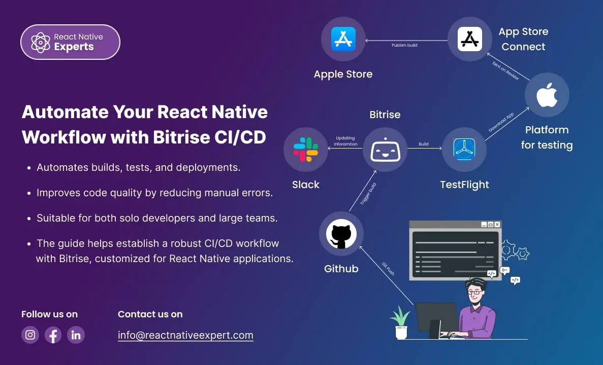
Introduction: In today’s fast-paced development environment, Continuous Integration (CI) and Continuous Deployment (CD) are essential for delivering high-quality software quickly. Bitrise is a leading CI/CD platform tailored for mobile apps, offering seamless integration with React Native. This blog will walk you through the process of setting up Bitrise for a React Native project, including code […]
React native Experts
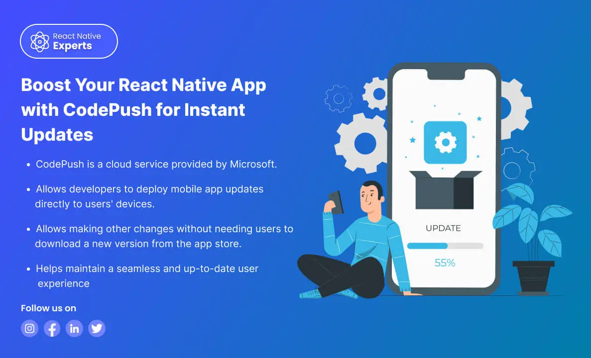
https://reactnativeexpert.com/wp-content/uploads/2024/07/Codepush.mp4#t=1 Introduction: CodePush is a cloud service from Microsoft that enables React Native developers to deploy mobile app updates directly to their users’ devices. This bypasses the traditional app store update process, providing a seamless way to fix bugs, add features, and make other changes without the need for users to download a new version […]
React native Experts
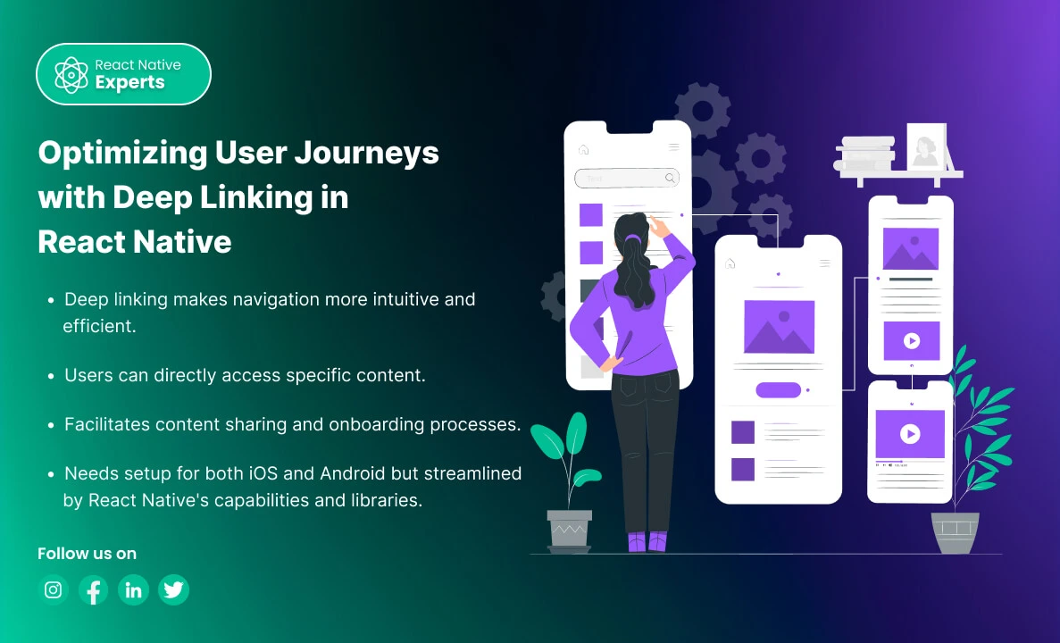
Introduction: Deep linking is a powerful feature in mobile applications that allows users to navigate to specific content within an app through a URL. In React Native, implementing deep linking can enhance user experience by providing direct access to specific parts of your app from emails, messages, social media, or other apps. This blog will […]
React native Experts
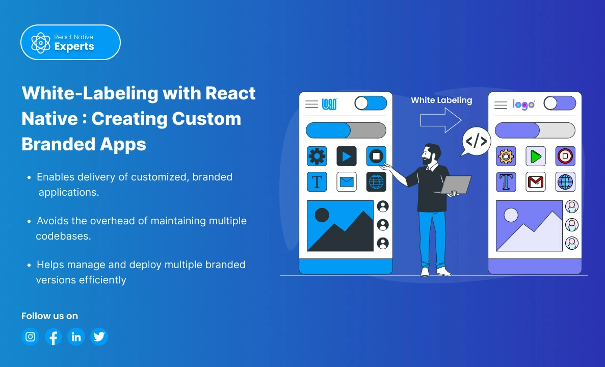
Introduction: White-labeling is a process where a product or service produced by one company is rebranded by another company to make it appear as its own. In the context of mobile applications, white labeling allows businesses to customize an app’s appearance and functionality to match their brand without developing an app from scratch. React Native, […]
React native Experts
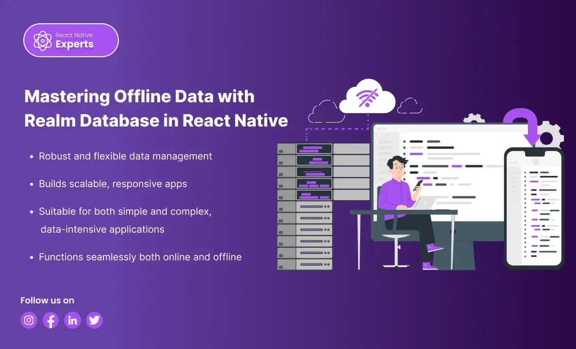
Introduction: In the dynamic landscape of mobile development, efficient data handling is paramount for creating high-performance applications. Realm Database stands out as a powerful solution for React Native developers, offering a blend of speed, simplicity, and offline capabilities. In this blog, we’ll explore why Realm is a top choice, how to manage offline data in […]
React native Experts

Introduction: When building mobile applications, managing data efficiently and ensuring offline capabilities are critical to delivering a smooth user experience. SQLite Database is a reliable and powerful choice for React Native developers. This blog will cover why SQLite is a top choice, how it facilitates offline data management, setup instructions (with description and query examples), […]
React native Experts
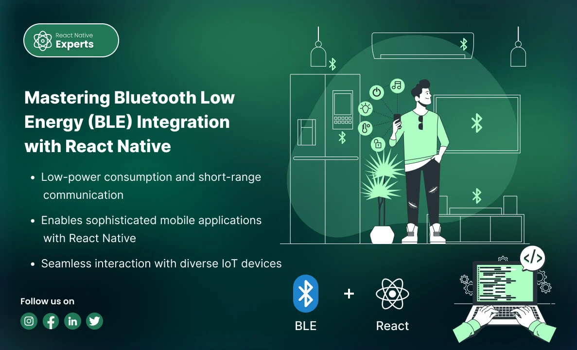
Introduction: In the realm of modern mobile applications, Bluetooth Low Energy (BLE) stands out as a crucial technology for enabling efficient, wireless communication between devices. Whether you’re developing health monitors, smart home gadgets, or industrial IoT solutions, understanding how to integrate BLE with React Native can significantly enhance your app’s capabilities. This professional blog explores […]
React native Experts

Introduction: GraphQL has emerged as a powerful tool for querying APIs, providing an efficient and flexible alternative to REST. When combined with React Native, it can significantly enhance mobile app development. In this blog, we’ll explore what GraphQL is, why it’s beneficial for React Native, how to connect it with a React Native app, and […]
React native Experts

Introduction: As mobile commerce continues to grow, integrating secure and efficient payment methods into your app becomes crucial. Apple Pay and Google Pay are two leading digital wallets that offer users a seamless payment experience. This guide explores why you should integrate these payment options into your React Native app, how to do it, and […]
React native Experts

Introduction: In today’s digital era, seamless Payment Solutions and secure payment processing are essential for the success of any mobile application that involves financial transactions. Integrating a payment gateway into your React Native app can greatly enhance user experience, security, and trust. This blog will explore why you should use a payment gateway and when […]
React native Experts

Introduction: In today’s fast-paced digital landscape, businesses need to quickly develop and deploy applications to stay ahead of the competition. Combining the low-code development capabilities of Mendix with the powerful mobile framework React Native can significantly accelerate the development process. This blog will explore what Mendix is, how to work with it, how to connect […]
React native Experts

Introduction: React Native has become a go-to framework for building sleek and responsive mobile apps. But what if you want to add that extra layer of interactivity—real-time updates, live data feeds, or instant messaging? That’s where Socket.IO comes in, and React Native experts can leverage its power to create truly engaging user experiences. What is […]
React native Experts

Introduction: Building mobile apps, especially with React Native, is fantastic! You can create beautiful, native-feeling apps for both Android and iOS with a single codebase. But even the most talented React Native developers know that debugging these apps can be a real challenge. Imagine a user happily browsing your app when suddenly it crashes. Frustrated, […]
React native Experts

Introduction: Today, many people and businesses want to create mobile apps for various reasons, like personal projects, brand visibility, or business growth. For businesses, finding the most cost-effective and efficient way to develop apps is crucial, especially since the demand for mobile apps is continuously growing. In 2022, users worldwide downloaded 255 billion mobile apps, […]
React native Experts
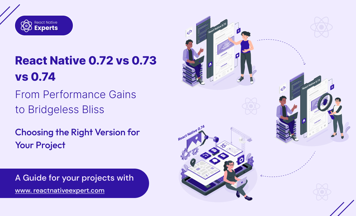
Introduction: React Native continues to evolve rapidly, empowering React Native experts to build even more performant and efficient mobile apps. Keeping up with the latest releases is crucial for staying ahead of the curve. ‘React Native 0.72 vs 0.73 vs 0.74’, In this blog post dive into the key differences between React Native Versions 0.72, […]
React native Experts
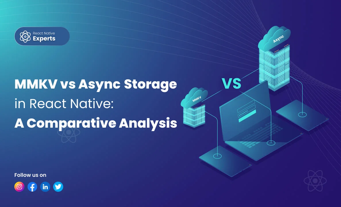
Introduction: React Native developers often face the dilemma of choosing the right storage solution for their applications. Two popular options for storing data are MMKV and AsyncStorage. In this article, ‘MMKV vs AsyncStorage in react native’, we’ll conduct a comparative analysis of these two libraries to help you make an informed decision based on your project […]
React native Experts

Introduction: In today’s digital era, mobile optimization is no longer an option but a necessity for small businesses looking to thrive online. With the ever-increasing use of smartphones and tablets, ensuring your website is mobile-friendly is paramount to attracting and retaining customers. In this comprehensive guide, we’ll delve into the importance of mobile optimization and […]
React native Experts

Introduction: In the ever-evolving landscape of mobile application development, React Native emerges as a beacon of innovation, driving the evolution of cross-platform solutions. With the release of React Native 0.73, developers and businesses witness a transformative update, enhancing capabilities and redefining the developer experience. This article delves into the evolution of React Native, highlighting the […]
React native Experts

Introduction: In the digital age, e-commerce has become a cornerstone of the retail industry, and mobile commerce (m-commerce) is rapidly gaining ground. With consumers increasingly turning to their smartphones for shopping, businesses are looking for efficient ways to capture this growing market. Enter React Native – the open-source framework that is revolutionizing the way e-commerce […]
React native Experts

Introduction: Devin AI vs. React Native Experts, Let’s delve into the intriguing comparison between React Native experts and Devin AI, the world’s first fully autonomous AI software engineer. As a React Native developer, you’re likely curious about the capabilities of Devin and how it stacks up against human expertise. Buckle up as we explore this fascinating topic! […]
React native Experts

Introduction: In the competitive realm of mobile app development, startups often face daunting challenges due to limited resources and budgets. Unlike tech giants, they can’t afford separate development teams for different platforms. This is where React Native emerges as a game-changer, empowering startups to create high-performing apps, stand out in the market, and stay ahead […]
React native Experts

Introduction: In the dynamic landscape of mobile app development, staying ahead of the curve is not just a goal but a necessity. As we step into 2025, React Native stands tall as a cornerstone technology, offering unparalleled flexibility, performance, and scalability. In this blog, we’ll take a deep dive into the top React Native development […]
React native Experts

Introduction: In today’s dynamic and digitally interconnected world, mobile applications have emerged as indispensable tools for businesses aiming to connect with their target audience, streamline operations, and drive revenue growth. As consumer behavior continues to shift towards mobile-first experiences, businesses must adapt by embracing innovative solutions that enhance their online presence and engagement strategies. One […]
React native Experts

Introduction: In today’s digital era, delivering exceptional user experiences is a top priority for businesses. As the demand for seamless, interactive, and visually appealing interfaces continues to rise, the role of React Native experts and remote developers has become increasingly vital. Let’s explore the significance of these professionals and the unparalleled value they bring to […]
React native Experts
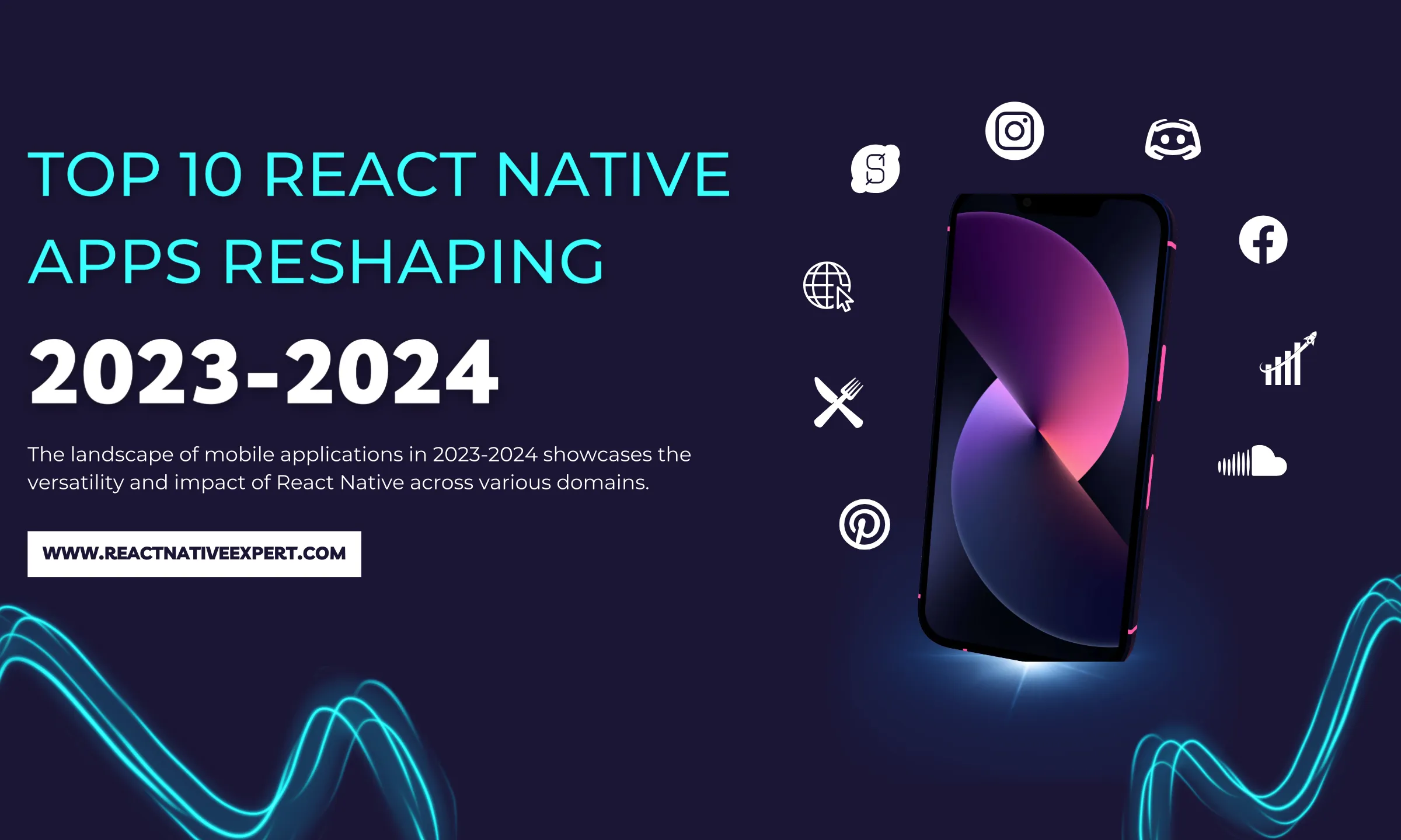
Introduction: React Native Apps have transformed the mobile development market by allowing developers to construct high-quality, cross-platform applications with unprecedented efficiency. As we progress through 2024-2025, React Native’s influence grows across a wide spectrum of applications that are transforming the digital world. From social media behemoths like Instagram and Facebook, which continue to set new […]
React native Experts

Introduction: In the rapidly evolving landscape of mobile app development, finding the Perfect Mobile Development match for your project is crucial for success. The demand for skilled developers, especially those well-versed in cutting-edge technologies like React Native, has never been higher. Whether you’re looking to hire React Native experts, considering remote developers, or exploring top React […]
React native Experts

Introduction: In the fast-paced world of mobile app creation, React Native is like a superhero, changing the game and making app development an exciting adventure. With its ability to craft robust and dynamic applications for both iOS and Android platforms, React Native has become the go-to choice for developers and businesses alike. As React Native […]
React native Experts

Introduction: In the fast-paced world of mobile development, choosing the right technology for your project is crucial. Among the myriad of options available, React Native stands out as a top choice for many businesses seeking a cross-platform solution. If you’re considering harnessing the power of React Native, finding the perfect development match is essential to […]
React native Experts

Introduction: In the dynamic world of mobile app development, React Native stands as a beacon of innovation and efficiency, weaving seamless experiences that not only captivate users but also drive sales and income. At React Native Experts, our React Native development prowess takes your unique ideas and transforms them into digital masterpieces. Let’s embark on […]
React native Experts

Introduction: Whenever we push our code in Git, we have to check code syntax issues or code styling. But we often forget these things, so how can we overcome this? The solution is to use an automated tool whenever we push our code changes in Git, it will automatically check syntax or styling issues. For […]
React native Experts

Introduction: In today’s fast-paced world of mobile development, React Native has emerged as a game-changer. This cross-platform framework enables developers to create mobile apps for both iOS and Android with a single codebase. However, like any technology, React Native apps can benefit from optimization to ensure top-notch performance. In this blog post, we’ll explore the […]
React native Experts

Introduction: In today’s fast-paced digital world, creating a seamless and captivating user experience is crucial for the success of any mobile application. React Native, a powerful framework for cross-platform mobile development, has become the go-to choice for businesses and developers looking to create high-quality apps efficiently. In this blog, we’ll delve into the world of […]
React native Experts

Introduction: In today’s fast-paced digital world, businesses are turning to cross-platform mobile development to efficiently reach users across iOS and Android. Among popular frameworks, React Native vs. Flutter sparks a recurring debate on which is best for seamless mobile app development. This blog explores the pros and cons of IT outsourcing with React Native and […]
React native Experts

Introduction: Fastlane stands out as a pivotal tool in the arsenal of mobile developers, providing a streamlined path for automating the build, test, and deployment processes of mobile applications. For React Native developers, incorporating Fastlane into the workflow is a game changer. It not only enhances efficiency but also ensures consistency across builds, ultimately leading […]
React native Experts

Introduction: In today’s app-driven ecosystem, monetization is a critical element for developers, and in-app purchases stand at the forefront of this drive. However, managing these purchases can be a complex endeavor. This is where RevenueCat shines. Offering a streamlined solution for in-app subscriptions and purchases, particularly for platforms like React Native, it’s becoming the go-to […]
React native Experts